Samsung considers the Galaxy S10 and S10+ to be “next-generation” smartphones, but do the sum of all the new parts make a strong case?
I had seen the new devices at the launch event in San Francisco, and came home with a Galaxy S10+ to review, as I’ve done here. Though I didn’t get the chance to test the S10 at the same time, much of what I’m describing here will also apply to that phone, unless stated otherwise.
The whole S10 line—even including the S10e, which I’ll look at separately in a later post—is not so much a makeover, it’s an affirmation of what came before it. Samsung played up the new pieces and parts they included in the new phones. They didn’t overhaul much here, only making some significant changes to up the ante on what you see and do.
Samsung Galaxy S10+ SpecsDisplay: 6.4-inch 3040 x 1440 Dynamic AMOLED display 19:9 aspect ratio with 522 pixels per inch |
Familiar, in a different way
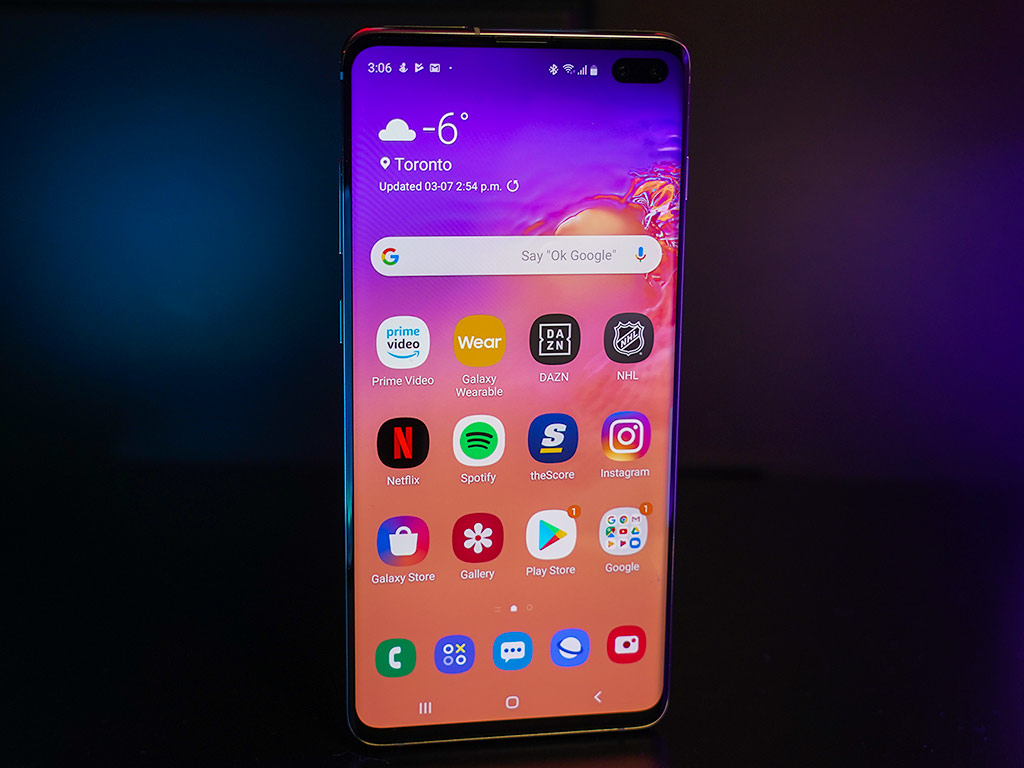
Any phone with a 6.4-inch display is going to be big, and the S10+ is no exception. Except it doesn’t feel monstrous, owing to the thinning bezels framing the screen. Samsung calls it a Dynamic AMOLED, and frankly—it’s one of the best screens I’ve ever seen on a phone. Bright, vivid, vibrant, colourful and sharp, it’s very easy on the eyes, to say the least.
While the curves on the display and corners are less pronounced, two other major factors contribute to the screen’s design. First is the way the two front-facing cameras sit in the top right, like an island in water. Rather than have a notch drooping down, the company carved out an enclave to facilitate the two lenses (it’s one lens for the S10 and S10e). Moreover, you will notice that most wallpapers Samsung offers purposely dim that corner to make it less conspicuous.
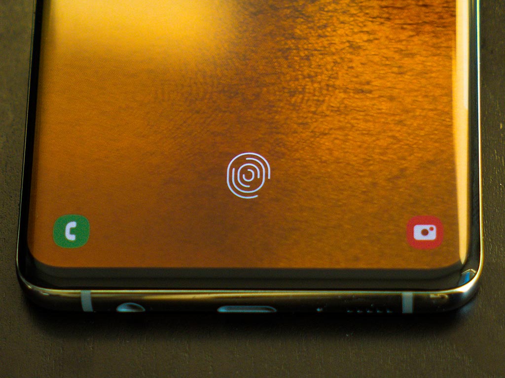
Then there’s the ultrasonic fingerprint sensor. This isn’t a capacitive or optical sensor, but rather one that actually lies below the screen. All you see is the fingerprint icon. While Samsung is not the first to use an in-display fingerprint scanner, it is the first to use an ultrasonic one.
The design principles mostly stay the same. Glass on the back, with buttons in the same places—and even a headphone jack. The internal speaker borrows a great deal from the Galaxy Note 9 and does sound pretty loud on its own. One notable cut is the iris scanner at the front, which is now gone.
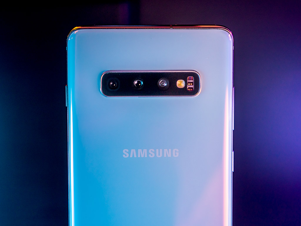
Samsung also added a third lens to the S10+ (and S10, but not S10e), introducing an ultra wide-angle to the other two. That gives the phone three different lenses to work with, adding to the wide and telephoto ones.
More on the screen
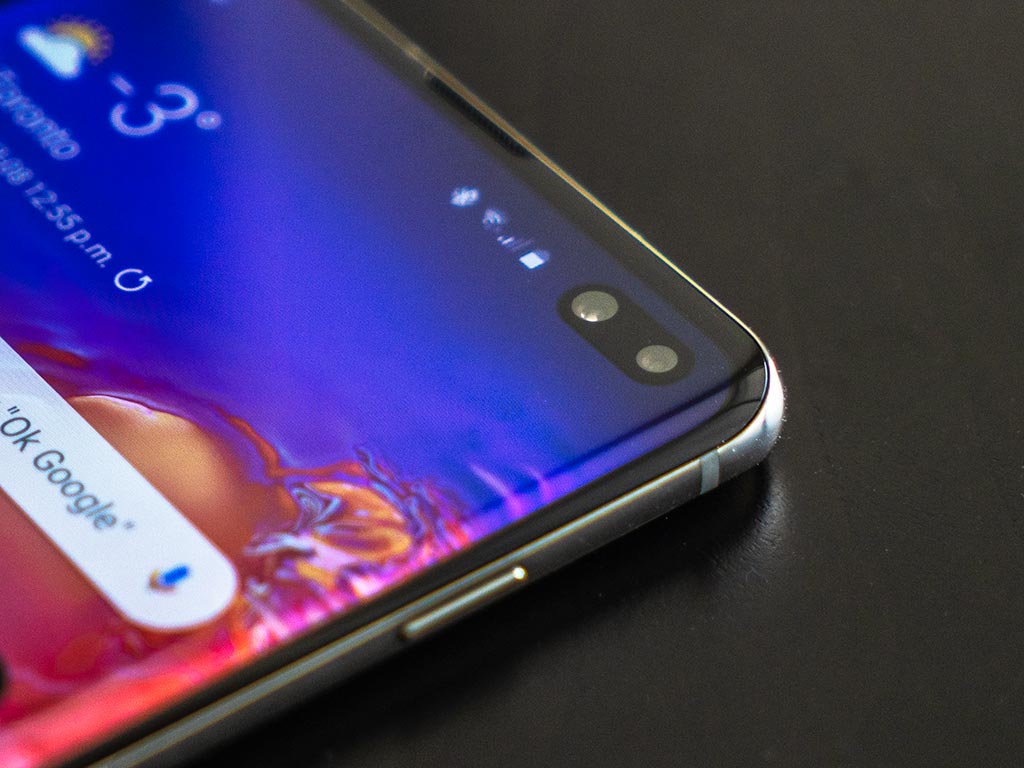 I did wonder how that enclave would appear over time. It never really bothered me or got in the way, other than those odd times when navigating the interface. Video and games don’t wrap around it, so it’s not an issue that way.
What’s more impactful is the clarity and vibrancy of the display. Samsung included HDR10+ support, and it does wonders for highlights and shadows for video and photos. The company has been guilty in the past of going too vivid with saturated colours in the past, but that’s been less of an issue more recently.
Here, there is a vivid mode you can choose to add contrast, even manually adjusting white and colour balance. I know every pair of eyes is subjective, but I would be surprised if anyone didn’t like how bright and clean the screen is on the Galaxy S10+ and S10.
The fingerprint sensor is also one of those things that is likely to improve over time. I observed an improvement through a software update on the eve of the phone’s launch. If that continues, it may become less inconsistent than it is right now. It’s not terrible by any stretch, just not quite as good as it should be.
Performance and software
The Snapdragon 855 processor and 8GB (or 12GB with certain variants) of RAM ensure there’s plenty of power under the hood here. I doubt you will find any performance issues early on. It’s a super smooth experience, and all that fluidity feels better because the software has some improvements, too.
The new “One UI” running on Android 9.0 Pie had already rolled out to the S9 and Note 9, but it’s here out of the box. Some of the improvements are subtle, but many make a difference over time. For instance, larger icons, better settings layouts, and menus make it easier to find things. Swiping and navigating with gestures felt smoother to me, even from when I first tested on those previous Samsung handsets.
Truth is, there is a lot in there. This is one reason why I had hoped Samsung would streamline its settings app. You can still search for whatever you like, but it’s not a bad idea to take some time to look through. For example, one neat feature that’s off by default is Dual audio, where the phone can simultaneously stream to two Bluetooth headphones or speakers. Another is Smart pop-up view under Advanced features, which sends notifications as icons you can preview.
Then there’s the Bixby button on the left edge. Finally, Samsung is letting users reassign it. At one point, I set it to open Google Maps or Google Assistant, while a double-click would trigger Bixby. Just note that Bixby has to be one of them; you can’t ignore it completely when assigning the button.
As much as I loved the screen, I wish it wasn’t so sensitive on the sides. I caught myself accidentally selecting things as I was picking it up or laying it down. The Edge Panel interface is still there, but you can turn it off entirely, which I did after a while. Ironically, as easy as it was to accidentally tap something, as I described, I didn’t find accessing the edge menu as intuitive.
That’s the thing about good hardware and software, though. It’s easier to nitpick at the things that are mildly annoying, but ultimately take little away from the experience. Samsung has long claimed the ability to customize the user experience on their phones, but I’ve never been fully convinced. The One UI is a big step in the right direction.
Camera
The Galaxy S10+ uses the same lenses and image sensors from the Note 9, while adding that third ultra wide-angle. That means you get the same variable mechanical aperture (f/1.5 and f/2.4) on the prime lens, and the same 2x optical zoom on the telephoto lens. The image sensors are still 12-megapixels.
To help capture better photos, you have the third lens, which I’ll get to, plus some software help. A “bright light” feature comes into play designed to improve low-light photos, but I never felt it was potent enough. That’s not to say images are bad, but I found Pro mode to be far better at reducing noise. While you’re likely to get something good in low-light, the Google Pixel 3 is still better in my eyes.
Despite that, you have a camera you can rely on in pretty much any situation. The 16-megapixel ultra wide-angle lens spreads out 123-degrees—the equivalent of the human eye. Photos won’t be as vibrant with that lens, and it struggles more in low-light, but the space it covers makes it fun to shoot with. LG was the first to try wide-angle lenses, and it’s nice to see Samsung finally embrace them, too.
Samsung also now uses the wide-angle lens for Live Focus, the bokeh mode. When shooting for depth of field to blur the background, you can be further back or closer to the subject than before.
Compared to the Note 9, the differences aren’t huge, with the obvious exception of the wider lens. Photo quality is going to be similar in most circumstances, especially because some of the same components lie in both devices.
Video recording gets something of an upgrade. You can shoot smoother action video using Super Steady mode, but there are a few caveats. First, it uses the wide-angle lens, thus reducing the overall vibrancy. Second, it’s fixed focus because it’s using that lens, so you can’t be too close to your subject. Third, it can only shoot in 1080p in that mode due to the processing power involved.
HDR10+ also comes into play here. Not only can you watch content supporting it, you can also shoot video supporting it. It does make a difference, except not every device can play it back after. So, for instance, if you share or transfer that video after, it may not work on everything you play it on.
Bixby
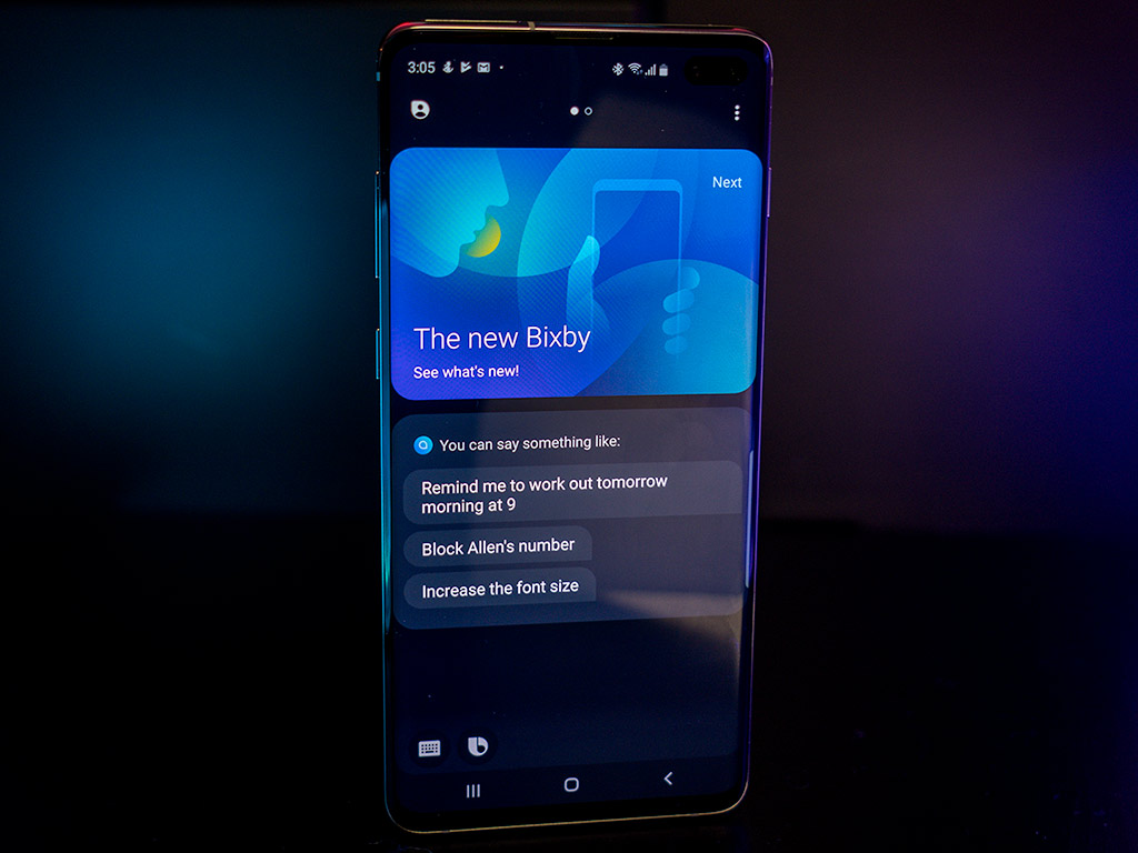
Samsung continues to push Bixby, it’s artificial intelligence platform, adding Routines to its repertoire. I feel like a broken record saying this, but it still is a work in progress. The cards it lays out can be useful when swiping right from the home screen. It’s just the voice assistant and how it integrates with everything else.
For the most part, Bixby is still very Samsung-centric. It mostly ties into other Samsung apps, which isn’t useful if you don’t really use them. I like that I can tell it to snap a photo or record a video, though I found it equally convenient to launch the camera from the lock screen.
For the basics, it’s not bad. Calling someone, weather forecasts, setting alarms, reminders or contextual info on a place, person or thing—those are fine. I found Routines more interesting when it came to manually creating them. The automatic features Samsung hyped still aren’t ready for prime time, in my opinion.
Bixby Vision is only effective within the confines of the partners Samsung has for it. Pinterest, Vivino, Foursquare and a few others are in there. I like the translation features via Google Text, except I could do the same thing via Google Lens.
Indeed, you can use Google Assistant in lieu of Bixby, should you want to. You can even program the Bixby button to launch it automatically. You just can’t completely disable or remove Samsung’s voice assistant.
Battery life
The Galaxy S10+ has a 4100mAh battery inside that acts like a beast. I was impressed at how well the phone held up with heavy usage in a given day. From video streaming to constant browsing, phone calls and app usage, it went through a full workday with plenty to spare.
One catch worth noting is that the phone defaults to a Full HD+ 2280 x 1080 screen resolution, and raising that to the full WQHD+ 3040 x 1440 resolution will affect battery life. To do that, go to Settings>Display>Screen Resolution>WQHD+>Apply. One way to conserve is to lower it back to Full HD+ when you need to.
The Galaxy S10 has a smaller 3400mAh battery so it won’t last as long in every circumstance. You will need to manage and conserve where necessary, though you should be able to make it a full day before needing to recharge.
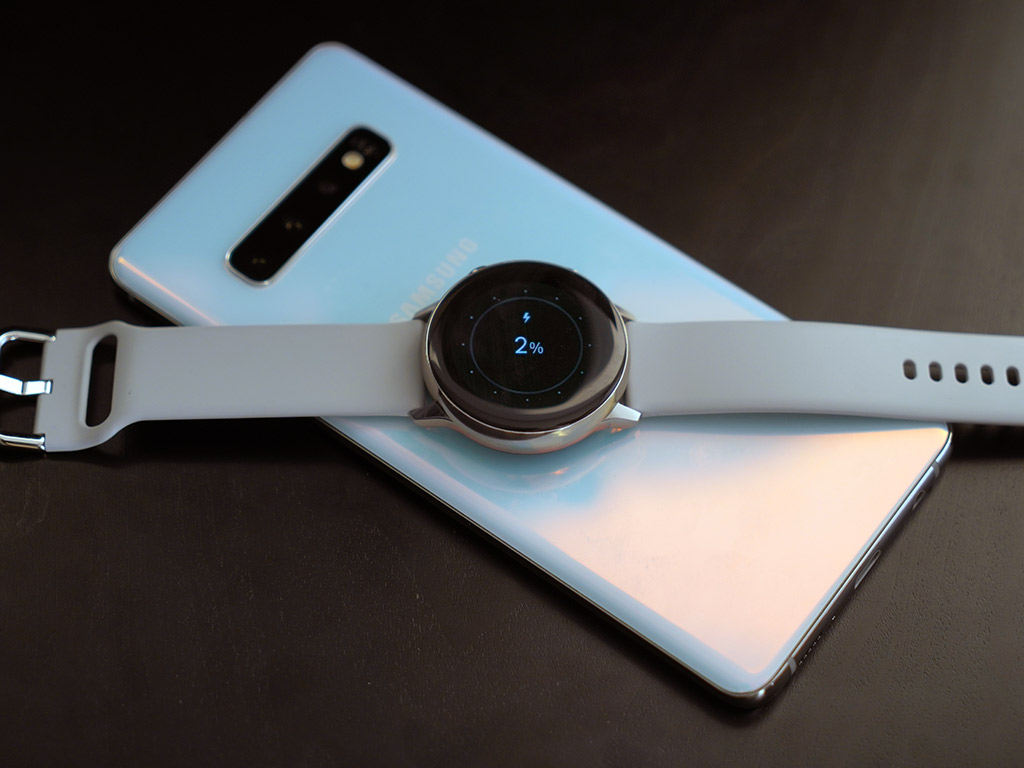
Samsung touted Wireless PowerShare as a cool way to reverse charge other devices. Turning it on in the notifications pulldown pane from the top makes the phone’s back a charging pad. Place a compatible device on it and you see it charge. This works with just about anything, from the Galaxy Buds to even a recent iPhone.
Final thoughts
If you have the Galaxy S9 or S9+, I see no reason to upgrade. I would say the same if you have a Note 9. The new features may be neat, and the screen gorgeous, but it’s not a huge leap forward. If you care a lot about the screen, and want the additional lens, then you can make a case for going this route.
It’s a much bigger difference when going back two years and beyond. The Galaxy S10+ is going to be one of the best handsets of 2019. It delivers the best overall performance to date, and mostly meets the high expectations that come with it. I would’ve liked a newer, more dynamic camera, personally, but I can trust shooting with it in most cases. There’s a lot to like with this device, especially in how well the software and hardware work together.
The Samsung Galaxy S10+, Galaxy S10, and Galaxy S10e are available now in prism black, prism white, prism blue and ceramic black.


