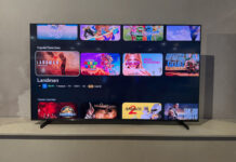
Sony has taken an entirely new approach to their TV design for 2014, and they are bucking the trend. Their competitors have made their sets slimmer and slimmer. Instead, Sony launched their innovative wedge design . I like the fact that Sony hasn’t simply followed the trend because the wedge design is not just aesthetically appealing, it also has a number of other functions that actually improve the TV.
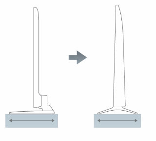
Smaller Footprint
The wedge design has a lower centre of gravity for the TV increasing the stability making it less tipsy. This lower centre of gravity combined with a better weight distribution means that the TV stand doesn’t need to be as wide or deep. This saves space and makes the TV a little bit safer as it will take more effort to tip it over. Although using the stand will take up less shelf space, it also looks great wall mounted.
 Sound
Sound
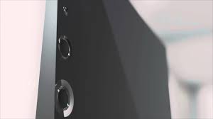
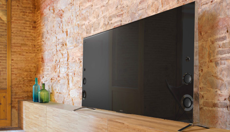
The problem with making TV’s thinner and thinner is that this continually compromises the sound quality. It is hard to squish decent speakers into a super thin set. The wedge design provides a lot more capacity to house the speakers, which is particularly important if you want to produce lower frequency bass tones. The wedge allows the placement of bigger front facing speakers near the bottom of the TV. More speakers are also placed up each side of the TV and get smaller as the wedge gets thinner. This provides a richer sound experience because there is a wider range of speakers that can deliver wider range of frequencies.
Simpler Connectivity
Sony’s wedge TVs Sony a port replicator that is separate from the TV, which you connect all your devices to instead of to the TV. No more struggling and fumbling in the back of the TV in order to connect additional devices or a flash drive. It also eliminates the clutter of a lot of extra wires behind the TV as the port replicator has one cable that connects to the TV.
Aesthetics
Although Sony’s wedge design doesn’t have the sleekness of the really skinny sets, it is very aesthetically appealing. The beveled edge on the side is elegant polished silver and the front has a deep black thin bezel, together making a very stylish unique design. Sony has proven that a TV doesn’t have to be really thin to be beautiful, as their “wedges” will look good in any space.
 Models
So what are the Sony wedge models and their features? So far they have a couple of Full HD models, the KDL 840B and the KDL 950B; and one 4K Ultra HD model, the XBR 900B. They are all extremely well appointed sets with a myriad of features. They are all 3D Smart TVs that have motion and colour enhancement technologies for a fantastic picture. They also all have multiple viewing modes that adjusts the screen depending on what you are doing. These include game, sports, cinema, photo, animation, and music modes.
The Full HD models are extremely similar to each other, with only a few differences between the 840B and the 950B. They have all the same specs except the 950B has a Triluminous Display, whereas the 840B uses Live Colour Creation to enhance the colour. Triluminous is slightly more advanced technology, but they are both excellent sets in terms of presenting vivid realistic colour. The other difference between the two models is their Motion Enhancement Technology. The 950B again is slightly better but I doubt you will notice any difference in their performance.
Their XBR 900B 4K Ultra HD set is their top-of-the line flat panel with their best picture and their best sound, thanks to the wedge design. It is a 55-inch set, which may also be coming out in a 65 and 79-inch model. It is pricier mainly because the 4K resolution that makes the picture absolutely crystal clear. The Sony wedge is a great design and they have introduced it with some great TVs.


