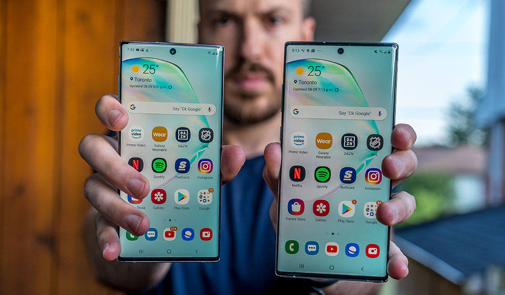
Samsung splits the Galaxy Note10 in two with not one, but two big models to choose from, and if size truly matters to you, this duo might be the right fit.
The Note line has always been about two things: big screens and the S Pen. The former are more widely available now than ever, but the latter remains a staple of this device. Indeed, it’s the one key differentiator from Samsung’s Galaxy S line. Over the last two years, the two lines have increasingly blurred, where one iterates to the other. If much of these two phones feels like the Galaxy S10 and S10+, it’s no accident.
Still, it’s new to choose from two new Note devices; it was always a solo act. I got to review both devices, and where applicable, I will note (no pun intended) the differences between them.
Samsung Galaxy Note10 SpecsDisplay: 6.3-inch 2280 x 1080 Dynamic AMOLED display 19:9 aspect ratio with 401 pixels per inch |
Note to Note
It says something that the phone with a 6.3-inch Super AMOLED display is the smaller one. But that’s exactly where the Note10 lies next to its larger sibling. The Note10+ sports a 6.8-inch display—inching closer and closer to where 7-inch tablets are. It also has a higher resolution and pixel density than its smaller sibling does.
There are other contrasting changes that stand out. In making the bezels almost non-existent in these phones, it looks like Samsung had to sacrifice the headphone jack to get there. Unfortunately, the company also chose not to include a USB-C-to-3.5mm adapter to plug in wired headphones. With the Note10, Samsung also removed the microSD card slot for memory expansion.
The Samsung Note 9 had three buttons, these Note10s have two. Samsung merged the power button with the action button previously assigned to wake up Bixby, the built-in voice assistant. With the Samsung Note10 and 10+, holding the power button down wakes up Bixby. Holding the button with volume down simultaneously will power it off. Another alternative is to pull down the notification shade and press the small power icon appearing next to the settings icon. These are default settings, but it is possible to set the power button to shut down or restart, effectively pushing Bixby aside. Double-clicking the button will either launch the camera or an app of your choice.
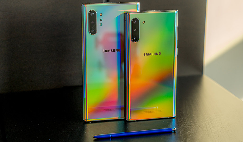
I would be remiss if I didn’t mention the unique colours Samsung chose for the back. The Aura Glow model I tested was a joy to photograph, simply because of how dynamic it looked reflecting light off its surface. The iridescent design adds some much needed dynamism, though with phones like this, I highly recommend a case. Try getting one that is see-through if you go the aura route.

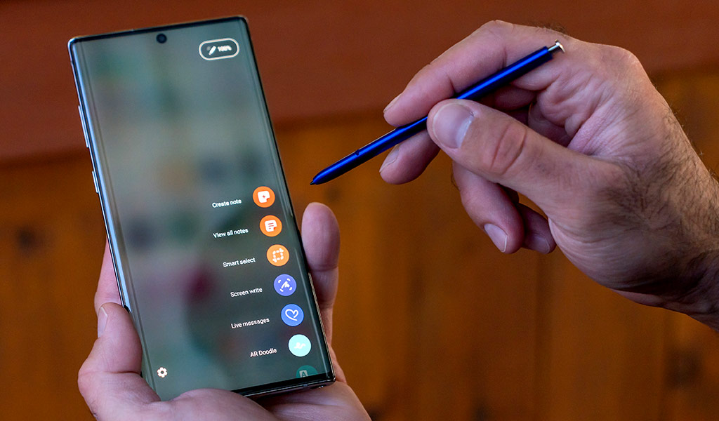
S Pen does more
I gave Samsung kudos last year for giving the S Pen something else to do beyond writing. It was limited to snapping photos or controlling media playback, but the foundation was good. This time around, the pen also has gesture controls, primarily for the camera.
It is, however, a work in progress. When I tried it, I felt like I had to learn the cadence in which the feature actually works. For example, I had the phone propped up on a flat surface facing me and wanted to zoom in or out. Air Actions, as Samsung calls them, let me rotate clockwise or counter-clockwise to zoom, except I couldn’t just rotate continuously. I had to hold down the button and rotate once, then repeat the process to zoom in further.
I had an easier time switching from the rear to front camera or camera modes left to right. When I tried it with YouTube, I could play, pause, control volume and skip to the next video. It was easy to click to play and pause. The other gestures took time to grasp.
Perhaps the more impactful S Pen change is the Microsoft Office integration. You can jot down notes on Samsung’s Notes app and then convert them to text you can use in Word. It’s neat and it works, and I’m hoping Samsung partners with others to do the same. One caveat I’ve always felt about the S Pen is that writing smaller letters and words on it is just not as easy as it would be on paper of a similar size.
There’s also AR Doodle, a new feature to draw on people or objects and have them almost come alive through face-tracking and augmented reality (AR). I’ll touch on that in the camera section.

Performance and software
Both the Samsung Note10 and Note10+ run on the same processor, albeit with different RAM. The Note10 has 8GB, the Note10+ has 12GB. That’s more than enough for most people, so don’t look at the discrepancy as a huge chasm. In daily use, it really isn’t.
And, in truth, these phones run a lot like the Galaxy S10 and S10+ do. Hardly surprising, given they use the same chipset, and why Samsung made most of its comparisons to the Note 9. Is it faster and smoother than the Note 9? Yes, but it also depends on what you’re doing.
I did find the ultrasonic fingerprint sensor to be faster on the Note10 and Note10+. That wasn’t a feature on the Note 9, though, because Samsung introduced it in the S10 line.
I also noticed an interesting option for the S Pen under settings where I could use a different pen on my device. To test this, I left the pen in the Samsung Note10+ and took out the Samsung Note10’s pen. I was able to write and use it as if it was the original. Most won’t find it useful, but in the event you have two Samsung devices supporting S Pens, you can toggle that feature on and use one between them.
Samsung played up streaming games from a PC to the new Note phones, but that feature isn’t live yet. The company’s partnership with Microsoft allows users to link an account with either Note via Microsoft’s Your Phone app. The integration makes it easier to send or receive text messages on a PC rather than reaching for the phone each time. Samsung says calls will route through to the PC too, but that will come at a later time.
Then there’s DeX mode, which mirrors the phone over to a PC—and for the first time—a Mac. I don’t believe most Note users will actually use the feature, but it’s there, in any case.

Camera
I was surprised that Samsung didn’t change up the camera a little. The camera array here is basically a carbon copy of that seen in the Galaxy S10+. The one key aesthetic difference is the lenses line up vertically along the top left, exactly how Apple and Huawei already do it.
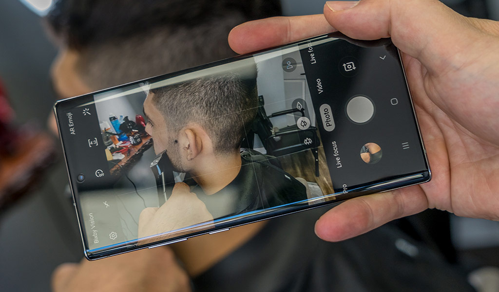
The Samsung Note10+ has an extra DepthSensor camera that mostly serves its purpose for AR and 3D scanning objects. I wasn’t able to test 3D scanning, but did see the sensor in action in certain modes. When shooting Live Focus stills or video, the sensor can add additional depth to the background for greater effect.
What Samsung didn’t specify is that the effect relies heavily on faces being in the shot. When I tried to do it with objects, the onscreen pop-up said it was waiting to focus on one. Moreover, there was a strange situation where the effect would focus on multiple faces, even if they were in the background. The result never looked natural, which is why Samsung will need to tweak how it interprets subjects.
The AR Doodle feature is another one of those acquired tastes. If you’re into Snapchat filters and other AR elements, you might find some fun with this, but I didn’t spend too much time with it myself.
I did shoot a lot of photos to gauge whether anything had changed in image quality, and found much of what I saw in the Galaxy S10+ still intact. That’s not to say images are bad, just that they’re not going to be better than the S10. When the S10/S10+ launched, there was no Night mode, like there is now. Samsung added it as a software update later, and while decent, I would have liked to see image quality improvements.
Battery life
When screens get this big, they tend to be the biggest reason why battery life takes a hit. That’s less of an issue with the Note10 because of the lower resolution, but overall, it’s not exceptional. The Note10+ isn’t that much better, despite having a much bigger battery inside.
You will get through a full day, but you may find you have to plug in to charge either before bed or after waking up. The 25W charger that comes with it can charge the phone from zero to full in about an hour or so.
Wireless charging is also a convenient alternative. Plus, the reverse wireless charging feature introduced in the S10/S10+ is included in both Note10s.
Final thoughts
The Note10 and Note10+ are highly iterative upgrades from the S10 models that launched earlier this year. They’re also not a massive leap from the Note 9, unless you consider the form factor and screen bezels enough of a big move. That’s not to say the phones aren’t beautiful—they most certainly are—and the aura colours are a great touch.
If you’re coming from the Note 8 or earlier, either Note10 will feel like a noticeable change. From the screen, the pen, fingerprint sensor and camera, there is a nice upgrade path between those two.
The Samsung Galaxy Note10 and Note10+ are available now in midnight black and ocean blue.


