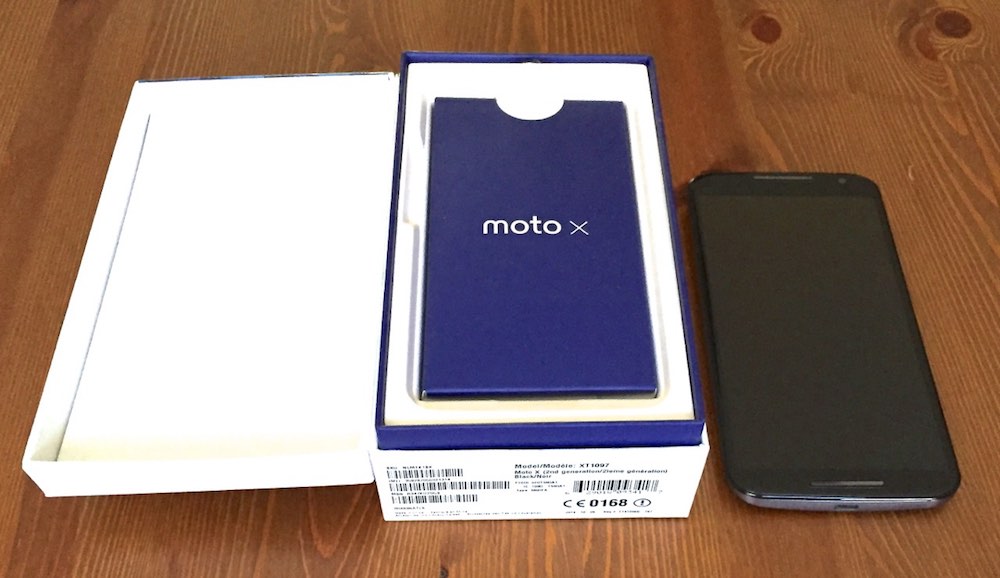
Last year’s Moto X was a surprise hit, winning praise for its attractive design, nearly pure Android UI and excellent value proposition. This year’s follow-up Moto X is much more than a spec-bumped version 2. The new Moto X is significantly bigger, much more powerful and gains new features, while retaining much of the appeal of the original. I just wrapped up a week with the 2014 Moto X and I’ll be sorry to see it go.
 Design and Build Quality
The 2014 edition of the Moto X is a significantly larger version than the original. That happens when you boost the display size from 4.7-inches to 5.2-inches. However, despite the expansion, this new Moto X gained only 5 g of weight and is actually thinner than the first generation.
Despite the size, its curved back with rubberized coating and thin bezels make it very comfortable to hold.
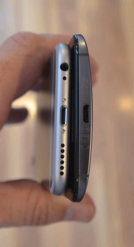
The only drawback to the design was how easily the backing attracted smudges and fingerprints —which proved more difficult to remove than if it had been made of smooth plastic. In the photo at right, you can see how the Moto 360 compares in profile to the super-slim (and noticeably smaller) iPhone 6.
The frame is metal and the Gorilla Glass 3 protected display curves gently at the edges to meet it. Overall, it’s a premium looking device with a reassuringly solid heft to it.
The Moto X isn’t IP-certified waterproof like a few competing Android smartphones, but Motorola says it’s treated with a water resistant layer to keep it safe from rain. I didn’t test this out, so we’re going to have to take Motorola’s word on it…
Display
As I mentioned, Motorola seriously expanded the display size for the new Moto X. They also upgraded it in a big way. Where last year’s model was a 720p AMOLED panel, this smartphone has a Full HD (1920 x 1080 pixel) AMOLED panel. That equates to a pixel density of 423 ppi, making for a crisp viewing experience.
With the 5.2-inch size and the high pixel density, text in e-mails is legible and sharp without having to zoom and video content looks pretty good too. A tablet is still going to offer a superior video viewing experience, but for movies on the go the Moto X’s display is more than worthy.

It’s a little overwhelmed by bright sunlight, but looks great indoors and has good viewing angles.
Processing Punch
The 1.7GHz quad-core Snapdragon 604 CPU in the first generation Moto X was a capable chip, but the new Moto X packs considerably more processing punch. Motorola is using a 2.5GHz Snapdragon 801 processor with 2GB of RAM this time.
The Moto X is a smooth operator, more than capable of handling the kind of everyday tasks a smartphone needs to do. I found no lag in switching between apps, the phone was always responsive and animations were smooth. Tasks that push both the CPU and GPU like playing video games are the ones that see the most benefit from the upgraded processor. Phone Arena posted a few benchmark scores for both the original Moto X and the 2014 Moto X to illustrate just how significant that processing improvement is.

Dual, Front Facing Speakers
If you like music (or watching movies) and don’t have a Bluetooth speaker handy, most smartphones deliver a pretty miserable audio experience. Tiny, underpowered speakers
(sometimes just a mono speaker) usually firing from the top or bottom are fine for notifications and ring tones but don’t make for great listening.
The Moto X has dual front-ported speakers and offers the best sound I’ve heard on a smartphone since the HTC One M8.
The odd thing about the speakers on the Moto X is that they protrude slightly above the display surface. Motorola says that helps to protect the display when the phone is placed face-down and I suppose that’s true. But they do look a little strange and on my tester, dust would accumulate around the edges.
Camera
The one area where the new Moto X failed to impress was with its camera. Motorola increased the resolution from last year, from 8MP to 13MP and added a “ring” flash (which is really just dual LEDs).
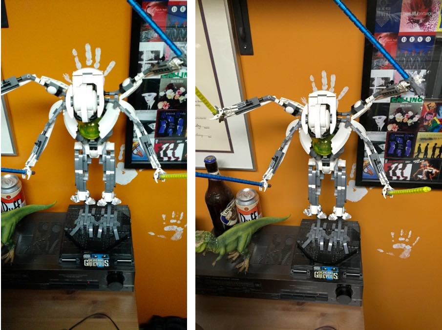
For point of comparison, I took the same shot with the Moto X and my 8MP iPhone 6. Both phones were left on default settings and the images have not been cropped or altered (other than to reduce the file sizes). The location is my office, in not great fluorescent light.

The Moto X produced a 2340 x 4160, 3.3 MB image while the iPhone’s was a 2448 x 3264, 2.3 MB image. Besides the obvious difference in native aspect ratio, the Moto X photo (left) shows less detail and blown out highlights compared to the iPhone 6 (right). The iPhone’s colour reproduction was also more accurate. The camera does have a manual focus and exposure option, but in many of the situation where you whip out a smartphone to snap a quick picture, fiddling with manual controls will take too long.
That being said, I’m not saying the Moto X has a bad camera, just not a great one.
It does better with outdoors, landscape-type shots than indoors in poor lighting and it does have one advantage over many competitors (including the iPhone): the ability to shoot 4K video.
Motorola Active Display
I don’t usually wear a watch around and haven’t yet committed to a smartwatch, so I typically rely on my smartphone if I want to check the time. With most phones, this requires pushing a button to wake the device before being able to see the clock.
The Moto X uses Motorola’s Active Display technology to eliminate the step. Pull the Moto X out of your pocket or wave your hand over it and the phone’s AMOLED display shows the time and notifications in white (saving power compared to actually waking) so you get a quick view of everything that’s going on. From there, you can touch to expand the notifications, fully wake the smartphone or let it go back to sleep.
It may not sound like a big feature, but I found it to be extremely useful.
(Nearly) Pure Android Experience
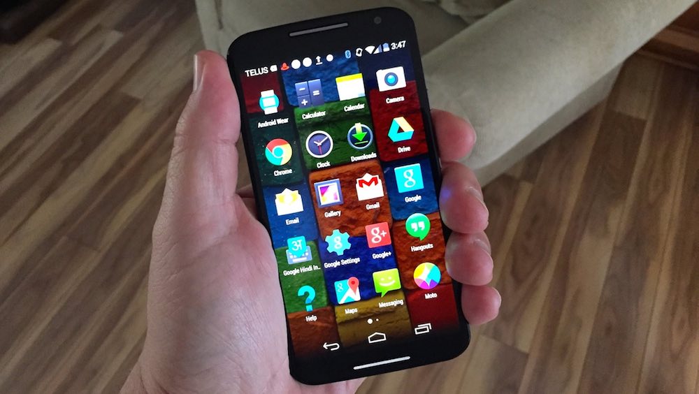
The Moto X really stands out if you’re an Android fan. Unlike many manufacturers, Motorola has left the stock Android UI essentially untouched. It’s added its own voice commands and apps, but there’s no interface clutter. The Moto X ships with Android 4.4 (Kit Kat) but Motorola expects to begin rolling out Android 5.0 (Lollipop) shortly.
Google Now’s launcher is one swipe away from the home screen, while the always-on microphones can pick up your “OK Google” command from a metre distance. One of the Motorola tweaks is that you can actually change that command from “OK Google” to something more personalized.

Battery Life
There was some concern that because Motorola had only modestly boosted the battery on the new Moto X (2300mAh compared to 2200mAh last year), the more powerful CPU and much larger display would result in poor battery life.
It’s not outstanding, but I had no complaints about the Moto X in this regard. It easily lasted for a 12 hour day of mixed use with power to spare.
Verdict
If there’s a big Android smartphone on your wish list, the Moto X is well worth considering. It gives nothing up on specs compared to other flagship smartphones, it’s comfortable to hold despite the size and looks pretty good too. It offers a nearly pure Android experience, supplemented by Motorola’s voice and motion controls. The camera isn’t at the same level as other smartphone shooters, but it’s not terrible either. And the Moto X is a bargain compared to many of the smartphones it competes with.


