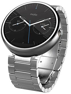
Smartwatches and wearables have been a hot category this year. It seems like everyone is making one, but this early in the game it’s tough to get things just right. Motorola’s Moto 360 has been one of the most hotly anticipated devices of the season because it’s one of the first out of the gate to tackle two challenges head on: it’s round like a traditional wristwatch, and with Android Wear it has an operating system built from the ground up for wearables. I’ve been spending some quality time with a Moto 360 and this is what I think about the latest must-have high tech accessory.
Unboxing and Initial Impressions
Many people have held off on the while smartwatch thing because up until now, wearing one meant strapping a square or rectangular chunk of gear to your wrist—a dead giveaway that you were wearing what amounts to a mini computer.
Some people like that, but many have been waiting in the hopes of something more traditional looking.
Motorola has made the most of being first to market with a smartwatch with a round face. Even the box the Moto 360 ships in is round, driving the point home. It’s been marketed as being a fashionable wearable almost as much as being a smartwatch and the device does deliver, but with a few caveats.
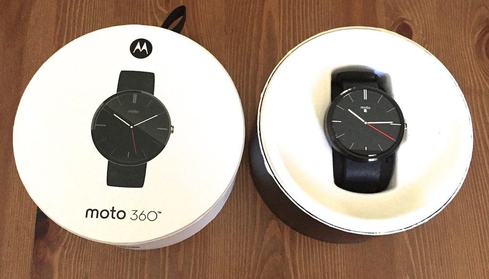
Yes, the Moto 360 is round. Looking at it in the box, it could pass for a traditional analog wristwatch. Its stainless steel case, high quality Horween leather strap and Gorilla Glass cover give it an upscale appearance. However, what doesn’t always come across in the promotional shots is how large the Moto 360 is. The diameter is 4.6 cm, and the case is 1.15 cm thick. So, yes, the Moto 360 could pass for a traditional wristwatch, but it’s an oversized and rather chunky wristwatch. If you have a narrow wrist, that oversized effect is going to be even more noticeable.
That being said, this is easily the best-looking smartwatch I’ve worn to date. (There are other versions of the Moto 360 available too that you can see at Best Buy.)
Setup
Motorola says the Moto 360 is compatible with any Android smartphone running Android 4.3 or greater. What they don’t really say outright is that the smartphone has to have Google’s Android Wear app installed before you can do anything with the smartwatch. Okay, that part is in the instructions, but it was a little annoying to power up the Moto 360 for the first time expecting to be able to access some basic functionality but having the device balk at doing anything until paired with a smartphone with Android Wear installed.
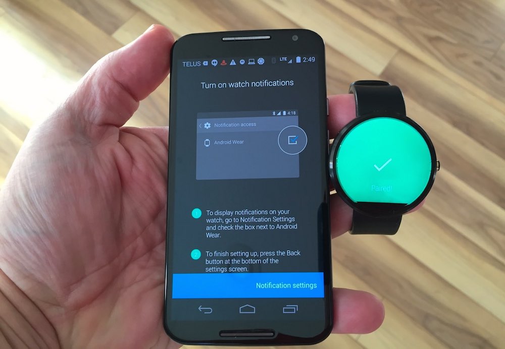
Downloading and installing Android Wear (a free app) was a momentary distraction, the two devices quickly paired and then the Moto 360 was ready for business.
The Display
Besides being round, one of the things that always grabbed me about the Moto 360’s promo shots was the display. Big and bright, it always stands out in photos.
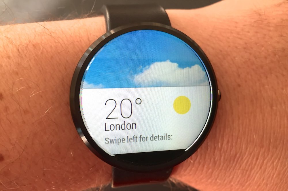
Seeing it in person was not a letdown. It’s not the highest pixel density thing out there (at 320 x 290 pixels it comes in at 205 ppi), but it still looks pretty good. A variety of watchfaces are included and each makes the most of the display. There’s the blue sky background with your local weather info, the digital watch and several variations on classic analog themes, complete with sweeping hand animations.
Motorola included an ambient light sensor, so the brightness of the display adjusts automatically (you can over-ride this if you prefer a constant look). I tried it outdoors on a sunny day and it’s a little washed out, but I was able to make out all the details without squinting.
To save power, by default the display turns off when not in use (again, you can over-ride this), waking up when you raise your hand.
The only complaint I have about the display is a small slice lopped off the bottom of it by the ambient light sensor. This makes the display not entirely round. It’s not noticeable with a black background, but with any other colour, you’ll see it.
 Android Wear
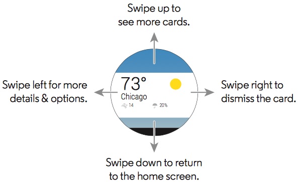
Google recently rolled out Android Wear as its official operating system for smartwatches and wearables. It features heavy Google Now integration and includes a UI that supports a round display—something that’s easier said than done.
Navigating the Moto 360 takes some getting used to, but once you have the hang of it, the user interface is pretty slick.
The Google Now integration pays off in contextual awareness, notifications and voice control support. For example, I mentioned a watchface that displays the current temperature in my city —there at a glance. When my Gmail account received an e-mail, the notification showed up on the Moto 360 immediately. With the “OK Google” command, I could ask questions, set an alarm or dictate a note (which then showed up as e-mail in my Gmail account). You can even display turn-by-turn directions right on the Moto 360.
Just remember, that you must have that smartphone within Bluetooth range for this stuff to work.
It’s Also a Fitness Tracker
The Moto 360 has a built-in pedometer and optical heart rate sensor. Between the two, there are all the makings of a decent fitness tracker, complete with built-in apps to quickly display the information at a glance.
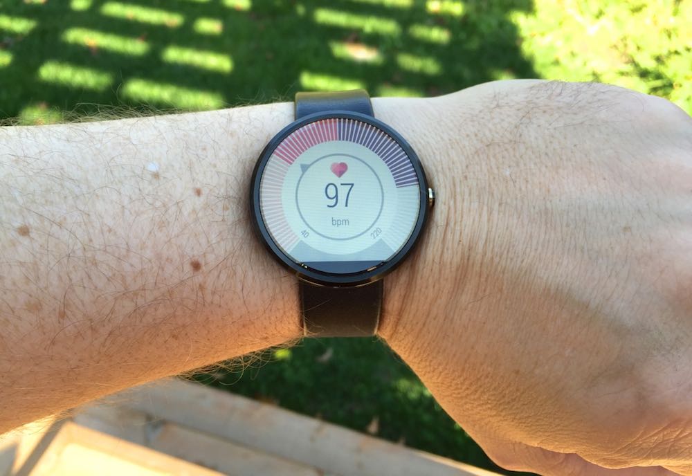
In this photo you can see the Moto 360’s heart rate sensor in action—this was also shot outside, on a sunny day.
Battery and Recharging
The rectangular form factor and lack of a purpose-built operating system were two design challenges early smartwatch models faced. The third factor was battery life. Unfortunately, that third issue remains a tough one to crack. Put a big battery in a smartwatch and people won’t wear it —it’s too bulky. But no-one wants to wear a watch that can’t the last the day on a battery charge. And everyone hates cables!
Pebble went with a black and white ePaper display to stretch battery life and when I tested the Pebble Steel, I found a week was the norm.
But the Moto 360 has that big, backlit display and so it faces the same battery life issues that most current smartwatches do. I stuck with the battery-saving defaults like using the ambient light sensor and letting the display sleep when not in use and by doing so, I’d usually have in the neighbourhood of 20 percent of the charge left by the time I went to bed.
Motorola calls it “all day mixed use” battery life. I wouldn’t call battery life great, but it should get most users through a full day.
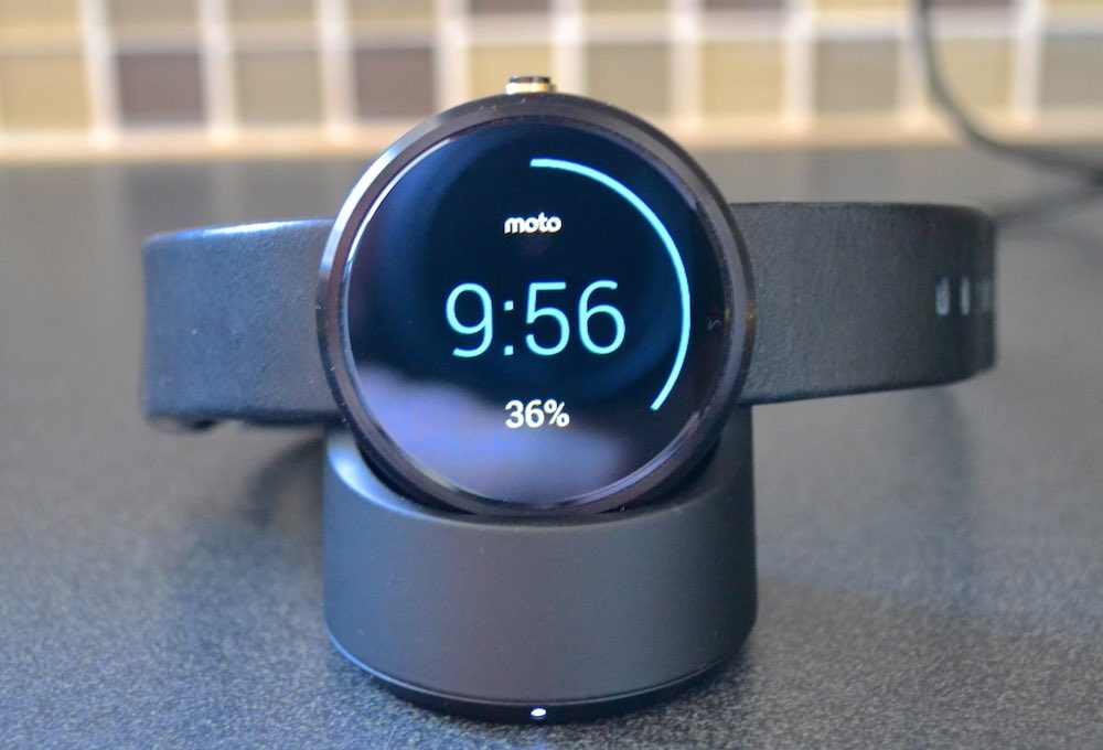
What gives the Moto 360 a bit of an edge is its wireless recharging system (you do have to plug the charger into a wall outlet). A small rounded stand has a magnetic inductive pad built in—simply set the watch on the stand, the back makes contact and it begins recharging. No wires, adapters or ports to fiddle with. And once on the recharger, the Moto 360 displays its battery level and the time, so you could keep it as a bedside alarm clock while recharging overnight.
Wrap-up
The Moto 360 isn’t perfect. There are a few design issues that mar an otherwise slick design. It would be great if that whole round watchface was display instead of losing the slice at the bottom, and it would pull off the classic wristwatch thing a lot easier if it was not quite so large and thick.
I ran into software glitches too, like the display that would change seemingly on its own initiative (one minute it’s showing the time, the next time I look it’s displaying the pedometer for some reason) the occasional refusal to wake no matter how many times I raised my arm and Google Now sometime mangling my speech commands. However, Android Wear is new and it’s going to get better, so I have no doubt that the Moto 360 will get better too as it receives updates.
But all the minor issues aside, there’s no disputing the fact that the Moto 360 is one beautiful smartwatch—easily one of the best looking to date—and one that puts a whole lot of functionality on your wrist.

