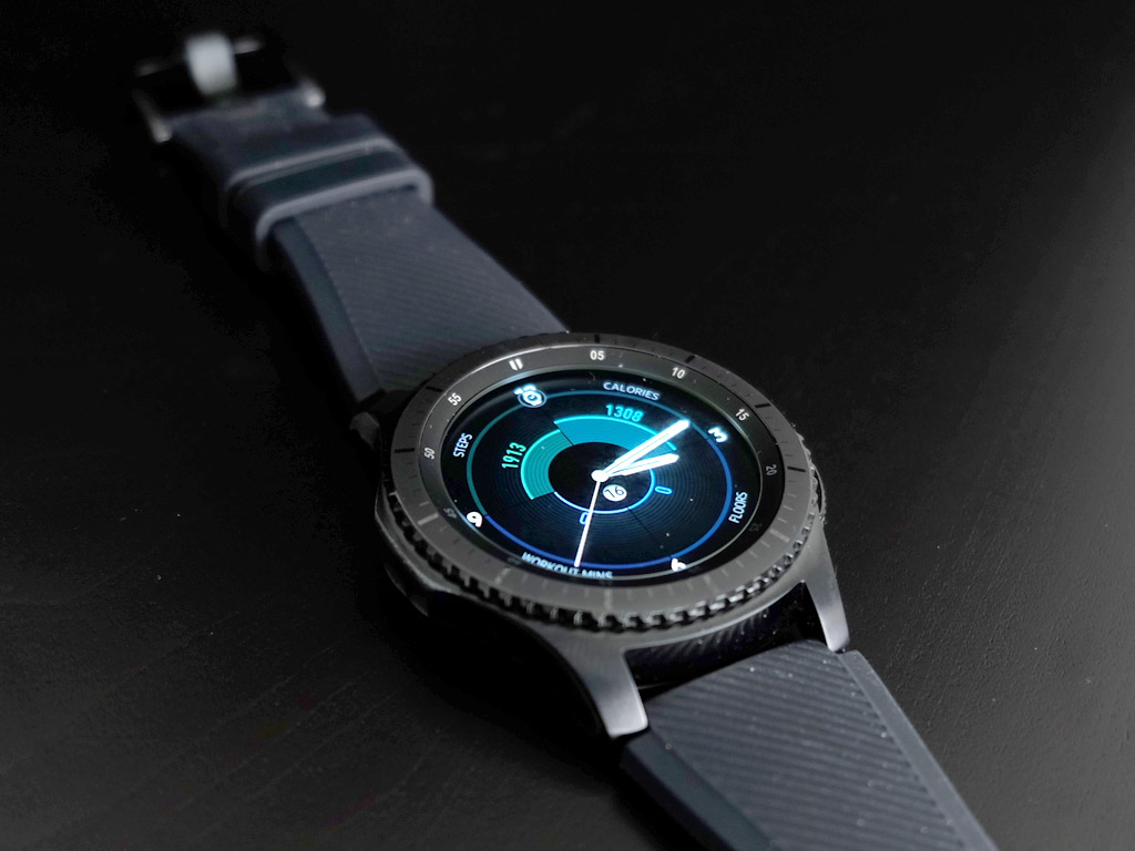
Samsung comes back to market again with its latest smartwatch, the Gear S3, a model that comes in two distinct versions: the Frontier and Classic. This review focuses on the Frontier, which is the active and fully-loaded of the two, thanks to a rugged design and new features that make it pretty robust.
The reason for the ruggedized focus is because the Gear S3 Classic has the aesthetics covered. By breaking it down to distinct designs of the same watch, Samsung is essentially separating the Gear S3 into two wants. The feature set within both is largely the same, so the choice mostly comes down to what look you’re going for.
Samsung Gear S3 Design and setup
Samsung clearly chose function over fashion with the Frontier. The silicone band is the plainest I’ve seen on any of the company’s smartwatches to date, and its thickness is equally notable because it increases the girth and heft of the watch itself. Stainless steel is great for the body, but in going with a 46mm frame, the overall heft of this watch really orients it towards men.
That’s assuming you have a thicker wrist. I personally have a thinner one, so the watch did initially look a little out of place. Part of that is based on how the Gear S2 looked and felt when I reviewed it last year, where a thinner band and smaller frame combined for a more refined appearance.
The Classic is more in line with the Gear S2. It is generally smoother and less contoured, unlike the Frontier that is clearly made to look like a sportswatch. One way to alter the Frontier’s look would be to change the band. Easily removable, any 22mm strap is compatible because of the easy spring-loaded release that keeps the strap in place. Given the bland strap the Frontier comes with, changing the band can make a big difference in how the watch looks. That won’t make it indelibly elegant, but does make it more smart casual.
Carrying over the same design from last year includes the basics in operation. The side has two buttons, one to go back, the other to go back to the home screen, with a bezel that rotates to navigate menus. The watch’s face is a touchscreen as well, so input is a little varied, but it’s a nice combination that does work well in most cases. Usually, it’s a case of navigating with the bezel and then making a selection with a finger tap.
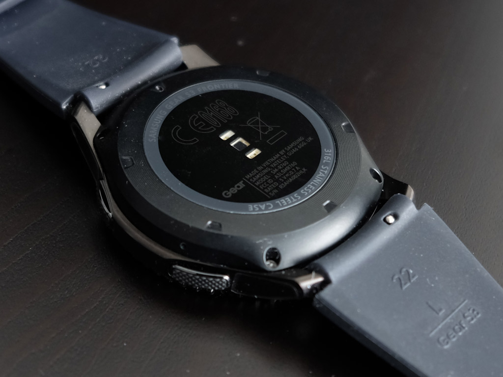
On the back of the watch is an optical heart rate sensor that is basically a mirror of the one used in the Gear S2. Having this allows the Gear S3 to read your heart rate and track exercises.
It uses Bluetooth and Wi-Fi to connect with the paired phone, and includes NFC for quick pairing (Samsung Pay is also supported through the NFC chip inside). There is 4GB of internal storage — only about 2.6GB actually free for apps and music — to store music files for direct playback without having to bring a phone along. Note that these are downloaded music files you already own that are not copyright protected, and they can only be transferred using Samsung’s own Music app.
Gear S3 Software
Like its predecessor, the Gear S3 Frontier (and Classic) uses Samsung’s own Tizen operating system. Already showing some promise last year, it has made a few more strides, though I think there’s still a lot of work to do.
Despite using Samsung’s own platform, this smartwatch can work with non-Samsung Android devices. The free Samsung Gear app available on Google Play can pair the two together. Samsung’s own S Health is the primary method in collecting all the activity tracking data, and that app is also available through the Play Store.
Not a great deal has changed, except that with a larger display, more icons can fit at one time. This is a 1.3-inch 360 x 360 AMOLED display, and it appears to be brighter than its predecessor, though I have no confirmation on that. There is some scratch-resistance and a slight tint to avoid glare, adding to the watch’s rugged design. Note that the Classic also has the same type of display.
Geo-restrictions is one of those problems that does come up with software in that certain app integrations available in other countries aren’t offered in Canada. Chief among these are Spotify and Philips Hue. In other jurisdictions, those apps work on the Gear S3 to control music playback and Hue lights without having to touch the phone. Unfortunately, those won’t work here until Samsung unlocks them.
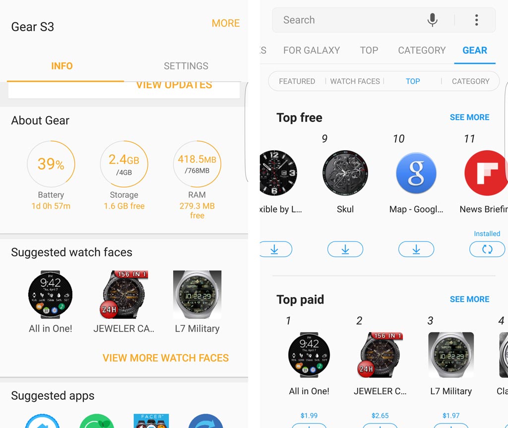
The Gear app includes a direct path to the Galaxy Store for apps and add-ons specific to the Gear S3. It’s very convenient, yet disappointing when compatible apps are taken into account. Uber is one that currently works. Nest Smart Thermostats are another one, though the app isn’t free. There’s a camera remote controller that is pretty neat, along with one specific to the GoPro. There is also a Philips Hue Remote app that is not made by Philips, and it works relatively well in lieu of an official app.
Despite the lack of integration and harmonization, it’s a decent showing for Tizen, a platform that is neither Android nor iOS. So long as Samsung remains a giant in the mobile space, developers will be interested in bringing something to it.
Performance
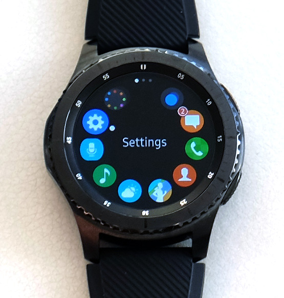 It’s best to view the Gear S3 first as an activity tracker in a watch form. I say that because the smartphone features that carry over don’t always translate beautifully. Case in point, S Voice is supposed to make it easy to set reminders, calendar entries or even make a call, except it doesn’t interpret as well as it does on the phone. There’s even a keyboard onscreen to type out messages, but it’s understandably clunky on such small real estate.
S Health, on the other hand, translates well, much like it did last year with the Gear S2. Having built-in GPS negates always keeping a phone handy to bridge location data, which is great for runners, cyclists and any other activity where distance is a factor. The layout and feature set for tracking and exercises is exactly like that of the Gear S2 and Gear Fit 2.
This is the synergy provided by Tizen, so graduating from either of those devices to this requires no real learning curve. Swiping right from the watch face eventually leads to some of the S Health screens. Opening that app directly from the app menu (a simple press of the home button from the watch face will do that) makes it easy to cycle through all the different options. The Gear S3 is designed to recognize exercises on its own, reminding me of how the Gear Fit 2 would do the same thing. However, it wasn’t always spot-on in recognizing exactly what I was doing, but it knew enough to distinguish walking from an elliptical or step machine, for example.
Like other wearables, the Gear S3 will vibrate and pop up a notification after 60 minutes of inactivity as a reminder to get up and at least move or stretch. I’ve always appreciated this from other wearables too, so it’s nice to have.
In the same vein, a heart rate sensor is great to have, but I would caution on its consistency and accuracy. This isn’t something specific to Samsung, as other optical sensors tend to do the same thing, but readings are simply not going to match a chest strap heart rate monitor. I noted a 5-10bpm discrepancy, and far less fluctuation with the Gear S3. It didn’t seem right compared to how I was feeling, and comparing the numbers proved what I had suspected. That’s not to say the sensor is pointless, only that you may want to subtract a few beats per minute in most readings.
A bigger body also means a bigger 380mAh battery, and I found Samsung’s rating of 3-4 days of usage to be pretty accurate. The charging cradle is pretty much the same as what the company used for the previous model, though it does take time to charge fully, as there is no quick charge functionality here.
One more thing: the Gear S3 Frontier is water-resistant, but not waterproof. A splash of water and limited exposure to a pool won’t kill it, but this is not a smartwatch to wear for swimming. That’s unfortunate, given other brands have managed to waterproof their watches, and the ruggedness already built-in to the body.
Final Thoughts on the Gear S3
Upgrading to the Gear S3 Frontier (or Classic) from the Gear S2 isn’t really necessary, in my view. You do it if you feel you should, but functionally, there isn’t a huge gap between the two. Battery life certainly is, with the larger battery on this watch outlasting what the Gear S2 could do by at least a full day.
The built-in sensors are fine, yet it’s the apps, or lack thereof, that continue to keep this watch from reaching its real potential. Why Spotify is being delayed is unknown, and hopefully other popular developers will look to bring their apps into the Tizen world for access through smartwatches like this. The Frontier is different from the Classic more from an aesthetic and robust perspective, rather than carrying a feature the other doesn’t. Either way, the Frontier is a nice smartwatch for being active, but not as much for looking good.
The Samsung Gear S3 Frontier is available now. The Classic is also available should you prefer that model.

