Samsung is flipping out yet again with the Galaxy Z Flip5 adding to its lineup of foldable phones, only this time you get a bigger cover screen. The Flip is growing up, showing a design maturity that arguably makes this model far more practical than its predecessors were, and that largely begins with said cover screen.
This is probably what the company had in mind for the Flip concept from the very start. Comparing the Flip5 to the original feels very familiar, save for the obvious cover screen differences and the much improved hinge. If you’ve been holding out for a foldable phone, this might be the combination you’re looking for.
Samsung Galaxy Z Flip5 (as tested):
|
A new cover for the Flip5
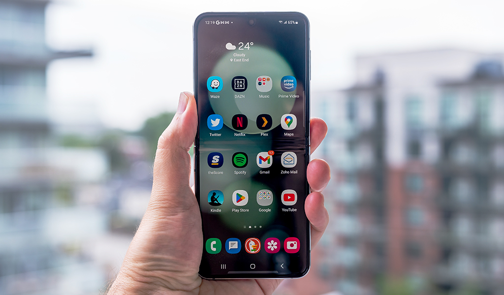
I went over many of the basic design changes in my initial hands-on with the device, especially with the Cover screen—or Flex Window, as Samsung likes to call it. I prefer Cover screen, personally, because that was what the smaller screen was always called before. In any case, the 3.4-inch display acts like a window into the device in that it can shortcut or integrate with notifications and apps. Without question, that means you won’t have to flip the phone open as often to do something.
In practical terms, that’s not new to the Flip line, as the Flip4 offered similar functions, but there’s a huge difference between a 1.9-inch and 3.4-inch display. The extra screen real estate does plenty for functional usability, ranging from checking out a map to framing a photo. All the previous app shortcuts return, like contacts, calendar, weather, audio recording, music playback and Galaxy Buds controls. It’s now easier to respond to incoming messages because you have a full QWERTY keyboard to type on, or preview photos you just shot.
There are a few things you must do to set all this up. Not all apps are optimized to work on a screen with such unique dimensions, so you have to shoehorn them in. One way to do that is to go into Settings -> Advanced Features -> Labs and toggle on the necessary features. They’re in beta, so expect bugs to happen, but they make it easier to run certain apps, like Google Maps and YouTube on the smaller display. Other third-party apps, like Spotify and Instagram, can also somewhat run on it, but the experience isn’t always great. There are apps in the Galaxy Store catering specifically to the Cover screen to open things up even more, though your results can vary.
A flatter perspective
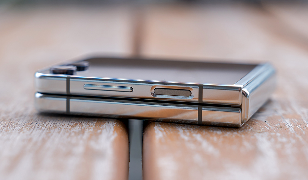
Samsung managed to achieve a flush finish by closing the gap between the two ends of the device. Now when you fold the Flip5, it looks clean and straight. That slightly reduces the thickness when folded closed but the phone is otherwise the same size when you flip it open. That includes the noticeable crease in the middle and the layered protector on the 6.7-inch display that you absolutely should not take off for any reason. It’s not entirely flush to the bezels so it can theoretically trap some debris in there if you’re not careful.
What puzzles me is Samsung’s decision to go with a glossy finish on the back of the device this time. The screen is already a fingerprint magnet, and now the back follows suit, meaning you will likely need to wipe the phone down more often unless you’re using a case. You may want to consider a case just to protect the more exposed Cover screen, as it is, and there are plenty of those available now.
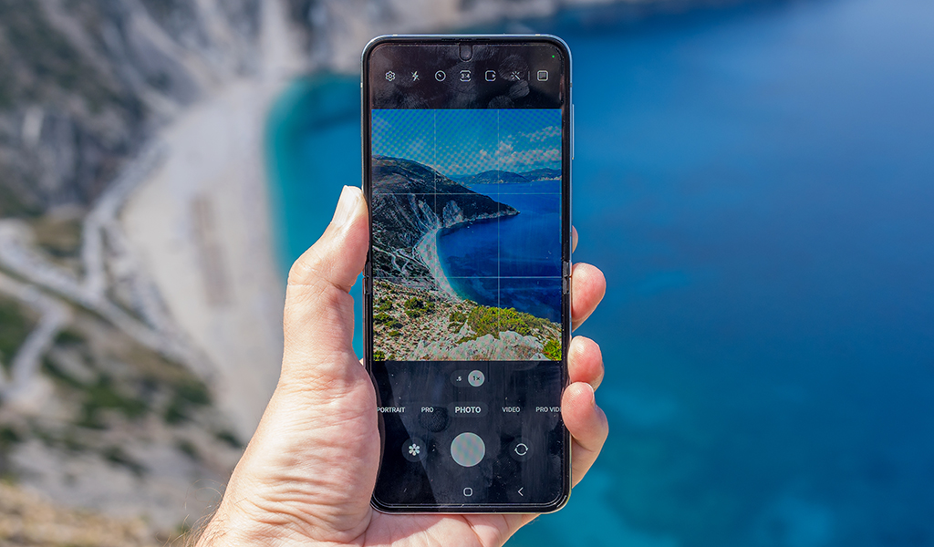
I still felt the same satisfaction when I heard the clapping sound every time I flipped the phone shut. Opening it also felt a little smoother this time, owing to the simpler hinge and its fewer moving parts. The only thing is the main screen is susceptible to glare because of the glass used to make it, so I had to crank up the brightness on bright sunny days. The good news is it got a big bump up in overall brightness, so you should have an easier time seeing it under those conditions.
The IPX8 protection also stands, keeping the phone relatively durable with clear water. Note, however, that the “X” in there means there’s no official dust protection, so be careful on that front.
Performance and software
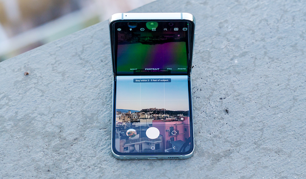
It’s nice to see Samsung stick to the same price despite doubling internal storage to 256GB. RAM stays at 8GB, albeit with the power of the Snapdragon 8 Gen 2 processor inside. For all intents and purposes, the phone should run most processes without issue, especially for mixed usage focused on calls, messages, social media and streaming media.
The integration between the two screens is also pretty good. Double-click the power button to launch the camera—while folded or unfolded. If you do it while folded and then unfold the phone, the camera app will switch to the broader interface. Same with phone calls or messages, where you can tap on a notification on the Cover and then flip open to deal with it. I tried it with a running YouTube video, and while a bit awkward, the hand-off did work.
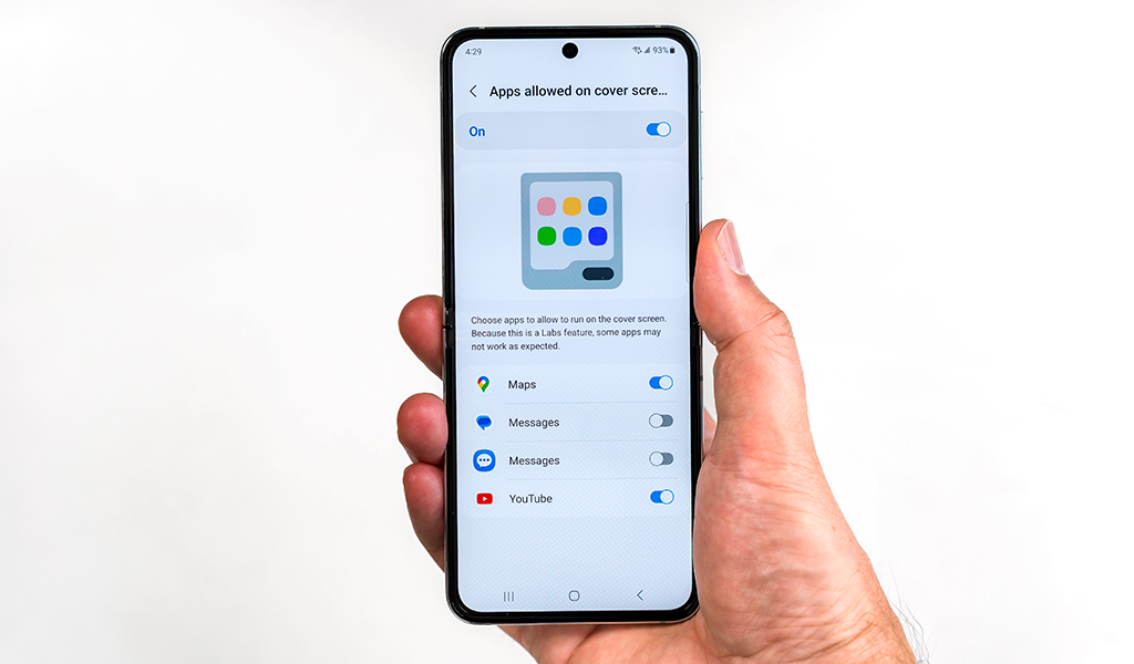
Flex mode also comes into play when propping the phone up in an L formation. It makes video calls a lot easier, but to ensure you get what you want, you have to force the issue. Go to Settings -> Advanced features -> Labs -> Multi window for all apps and toggle that on. You will then see Flex mode panel where you can choose the apps you want to work in Flex. Again, being in beta, your results may not be perfect throughout, but it’s a must to try.
Samsung’s One UI overlay doesn’t dramatically change anything. You still get the Edge Display shortcut menu, along with multitasking through the split-screen feature. As before, you can split two apps (top and bottom) on the screen, and then add a third as a floating widget. It’s neat, but not all apps support widgets properly, so results may not come out looking great.
Camera on the Galaxy Z Flip5
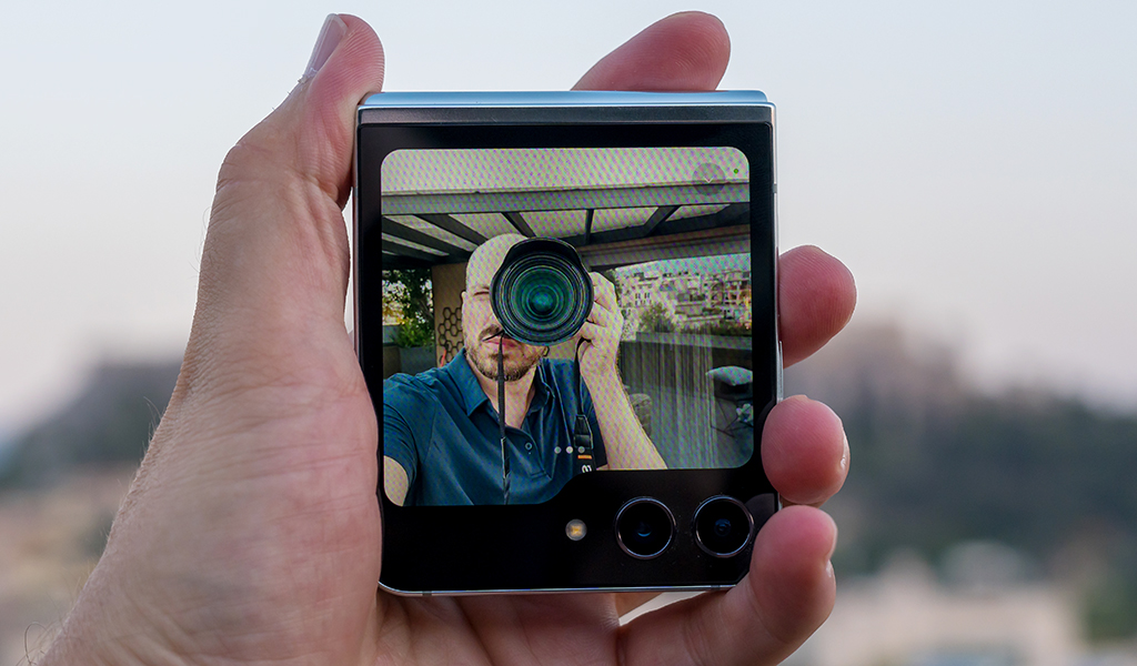
The Cover changes almost everything about the camera situation. It’s never been easier to take a selfie with a Flip phone like it is with the Flip5. A larger display with better brightness certainly helps, as does the waving gesture to capture the photo without touching anything. I had little trouble framing myself in a photo, including a portrait shot, as that remains an option, or especially a video. Since the Cover is using the rear cameras, you can switch between the wide and ultra-wide lenses too.
You may also want to try and get creative (safely, of course) by positioning the phone in ways to capture unique perspectives. For example, because the Cover is bigger, you can place the Flip5 down on a surface, tilt it to look up or down and capture photos that way. It’s flexibility that’s hard to pull off with conventional smartphones. Imagine placing one on the ground looking up at a tower or building where it would be incredibly difficult to not only frame the shot but also take it without securing its angle in the first place.





The wonderful creativity is great, only you will have to measure expectations on output. The two rear 12-megapixel cameras are pretty much exactly the same as the Flip4. Samsung’s software does a better job processing the images, but I didn’t see enough of a leap in quality, making this a marginal upgrade, and truly a pricier phone with mid-range cameras. You can still get very good results, especially in daylight and brighter conditions, with low-light and night shots holding up pretty well if there’s some ambient light to work with.
Battery life
The Galaxy Z Flip5 uses the same battery its predecessor did, leading to predictable results. Samsung is in a tough spot because the folding design limits the space inside to expand the battery unless it’s at the expense of something else under the hood. The newer Snapdragon chipset comes to the rescue (slightly) by helping the phone churn out roughly one extra hour, depending on screen brightness and the apps you’re running.
It supports wireless charging on the bottom half, but I found the glossy finish made it a little slippery on some charging pads, so chose to plug in via USB-C more often. No surprise that Samsung doesn’t include a wall charger in the box.
Final thoughts on the Galaxy Z Flip5
As I noted earlier, the Galaxy Z Flip5 feels like it’s grown up because of the Cover screen. Its very size means you’re just as likely to interact with it as you are the main screen, leading to habitual shifts that change how you utilize it. Notifications are far more actionable now, and photography becomes a more exciting pursuit when letting your creative side cut loose.
Foldables aren’t yet available in abundance. You could always go bigger with the Galaxy Z Fold5, but the Flip5 feels like a regular smartphone that folds in half. It’s practical and adaptable, which are two main reasons to even consider a flip phone like this in the first place.
The Samsung Galaxy Z Flip5 is available now in graphite, cream, mint and lavender.


