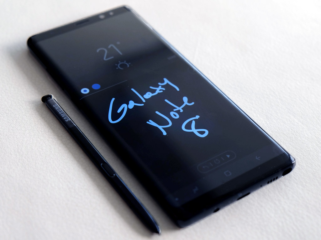
Seeking redemption for last year’s ill-fated Galaxy Note 7, Samsung’s Galaxy Note 8 is a serious follow-up and upgrade for previous Note users.
The Galaxy Note 8 is very much a combination of the features the Note 7 introduced and the design of the Galaxy S8+. Implementing both of these elements into this phone means it isn’t a radical change, but noticeable improvements were made where it counts.
Galaxy Note redux
The 6.3-inch Super AMOLED “Infinity Display” is only one-tenth of an inch larger than the Galaxy S8+. The 18.5:9 aspect ratio covers 83% of the phone’s front panel, making the bezels almost non-existent. To make room, Samsung also ditched the physical home button, replacing it with a touch-sensitive button with haptic feedback.
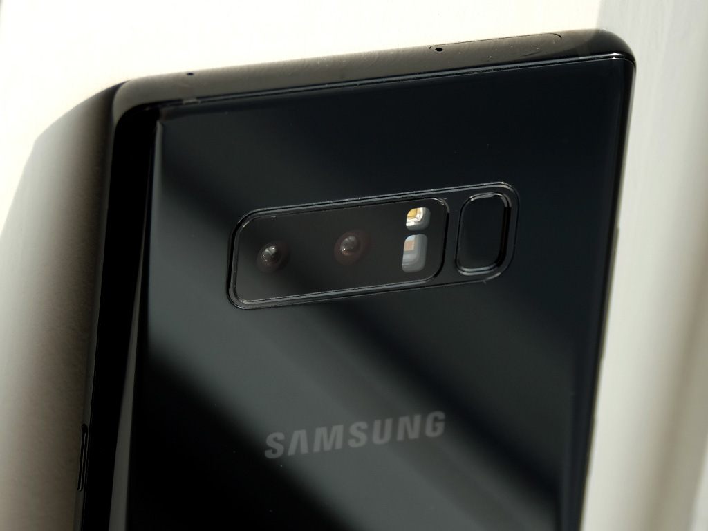
What else is similar? The iris scanner and facial recognition is back. The edge display and its interface is back. The glossy finish all over the phone makes it look sleek and stylish, but is also a fingerprint magnet. To avoid misplaced fingers over the rear lenses (a problem with the Galaxy S8 and S8+), the fingerprint sensor was given a little more space by putting the LED flash and heart rate monitor in between.
The similarities continue on with the phone’s internal components. Like the S8+, the Note 8 runs on the Snapdragon 835 processor, 64GB internal storage (with microSD card slot), yet has 6GB of RAM compared to the S8’s 4GB. Wireless charging support carries over here, as is the Quick Charge 3.0 USB-C port at the bottom. The same water resistance applies to the body as well. Oh, and there’s a headphone jack, in case you thought otherwise.
So, what’s different then? Questions over the battery are understandable, given what happened last year. The 3300mAh battery is actually small for a device this size, but erring on the side of caution to squeeze everything else in is probably not a bad idea.
Part of that cramming includes a second lens with a 2x optical zoom for the rear camera. This marks the first time Samsung has gone with dual lenses for its camera, and it pays dividends in good ways, which I’ll touch on later.
Software impressions
One thing about a larger display is that the software experience feels bigger too. The Note 8 comes with Android 7.1.1 Nougat installed, but an upgrade path to 8.0 Oreo is already assured. It’s just not clear when that will happen. There isn’t a huge difference here from what the Galaxy S8 and S8+ presented, which isn’t really a bad thing.
The bevy of security options also continue on. Beyond the iris scanner and face recognition, you have the password, PIN and pattern as options. The iris scanner is neat, though I’m still not especially fond of the facial recognition. It doesn’t work well in darker settings, and I’ve found photos can fool it into unlocking the lock screen.
Samsung’s caution clearly extended to the software, which looks and feels identical to the S8 and S8+. However, there is a useful new feature called App Pair that allows you to merge two apps together for Multi-Window setups. They even appear together in one icon. For example, I chose to group YouTube and Spotify together by creating it through Create App Pair in the Apps Edge layout. This way, I could play music from either app in one sitting without having to switch between them.
It would be nice if Samsung chose to retreat further from its own software overlay that really weighs down Android. This phone on a stock version of the operating system would be a real force. Dealing with the eccentricities of the software experience, as it is, is part of the trade-off here.
It’s not that the phone is slow. It’s actually quite the opposite. The power and fluidity of the device is obvious at every swipe and tap. The decision to make many of Samsung’s apps elective—thereby not taking up valuable storage—was a great step in the right direction. It’s just time to get rid of the redundancies. Why should there be a Samsung web browser when Chrome works perfectly fine? Why have an edge display interface when it’s difficult to access it one-handed?
The Note 8 has some variances that offset the software’s limits, though I still find the overall experience to be less than it could be if left more unfettered.
The S Pen
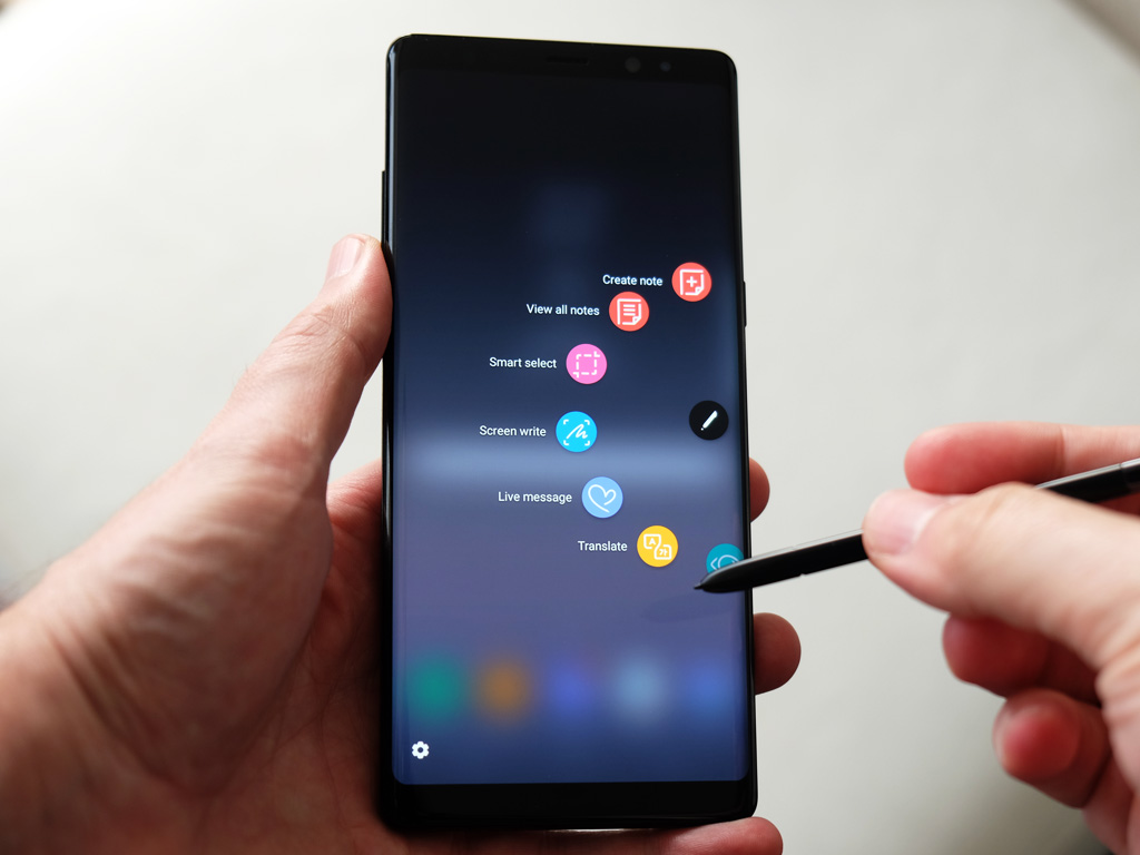
The Note line was generally popular for two reasons: the larger screen and the S Pen. In this case, the pen stands out more because the display is only marginally bigger than the S8+. There isn’t a huge upgrade to the pen’s performance, other than maybe a few tweaks to improve precision.
As before, clicking the onboard button above the screen lays out the carousel menu of compatible apps. New this time is Live Message, which I suspect will prove popular for those looking for a new way to communicate and share. The idea is simple: write a note or doodle something, and the phone will save it as an animated GIF. Users can send it to someone over any messaging app and it will play back when the receiver sees it. I did this with both Android and iPhone users and it worked flawlessly. Even BlackBerry users would be able to see them.
Indeed, the feature got so much positive feedback that some people I showed it to wanted to create notes they would then use as calling cards or social media images.
Next is Translate, which has now been improved to help translate entire sentences, rather than single words. It works the same way. Go to a foreign language page, select Translate from the carousel, hover over the sentence and it will present it in English or whatever other supported language you chose. Tapping the speaker icon will also speak it aloud for pronunciation.
Another new feature is Pen Up, a curated gallery of art people created with the pen. It’s nice to see how good some of the work is, but I suspect more inspiration will come from the colouring book templates Samsung is promising to bring to the phone.
Writing with the pen while the screen is off is another neat feature worth exploring, especially when saving a memo on the fly.
Camera
Adding a second lens in the back allows Samsung to finally do more with its camera. Previously, depth-of-field or bokeh effects were entirely software-driven. Combining the standard lens with a telephoto 2x optical zoom lens makes it possible to focus on two things at once. The feature is called Live Focus, and it allows for shooting a subject in the foreground, while controlling the blur level in the background.
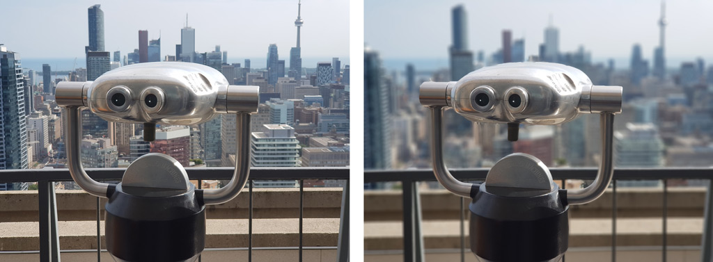
It’s a neat feature, and one that garnered a lot of positive feedback when I used it. The challenge was in using it in different situations. The telephoto lens has an f/2.4 aperture, which limits how much light gets through to the image sensor. The result is that Live Focus simply won’t work when the light is too dim. Also, you need to be at least 1.2 metres away from the subject, so it won’t work with macro photography, but does work well with people and objects further back.
The telephoto lens also works well to simply zoom in on something and shoot it. Again, good lighting matters when using it. The darker the light, the more noise that creeps in when using it.
Outside of that, the camera is very much a holdover from the S8 and S8+. Samsung improved colour reproduction, except it’s a minor improvement. Pro mode really shows how good the camera can be when you control manual settings, like shutter speed and ISO, to capture more dynamic images.
Without question, this is one of the best cameras on any smartphone to date.
Bixby
 Bixby was first introduced in the S8 and S8+, except it was pretty barebones at the time, and totally lacked the voice assistant element. That’s now live, and it’s off to a reasonably good start.
The dedicated button on the left edge or a swipe to the right from the home screen brings up the app. Setting up the voice is easy, and once I had it working, saying ‘Hi Bixby’ would wake up the phone. Following that with something like, ‘open Spotify,’ would have it ask for a voice password. Once I said that, the screen unlocked and app opened.
It’s pretty neat, especially in the way it integrates with Samsung’s own apps. I could have Bixby open the camera app and snap a photo with either the front or rear lens. Or it could send a text message in response to one I received. There are numerous scenarios that work well, and Bixby outlines them through both a tutorial and in the app itself.
The limitations do show after a while though. First, it’s currently only available in English. It can open third-party apps, but can’t do anything with them. For example, I could open Spotify but not get anything to play through verbal request. Only Samsung apps can go deeper with actionable tasks by voice. Spotify integration is at least coming before the end of the year, so it’s not a total loss.
It also lacks the depth and personality of something like Google Assistant. For instance, searching for a person, place or thing through Bixby doesn’t glean any verbal results. It’s simply a shortcut for a Google search. Assistant actually offers a brief level of context. Given that Assistant works perfectly on the Note 8, at least you can have both working for you when you need them.
The rest of Bixby is still in its early stages too. Bixby Vision, which uses the camera to identify products and retailers to get them from, is total hit or miss. Bixby Home is a decent mix of news and information to stay on track, but will be better once customization becomes a bigger factor.
It should be noted that all of Bixby’s features also work with the S8 and S8+, so they are not exclusive to the Note 8.
The battery
Naturally, this is going to be a cause for concern for some. I didn’t experience any overheating or issues related to the battery’s overall structure, so I think it’s safe to say the Note 8 won’t be a repeat of its doomed predecessor.
However, battery performance isn’t spectacular. With moderate usage, it lasted a full day for me without fail, yet once I started streaming media or using the camera excessively for video recording, I noticed a drop. It wasn’t a huge surprise. A big screen with powerful components will be a drain on any battery. In going with a smaller capacity, though, some range anxiety will become a factor after months of using this phone.
Final thoughts
Being so similar to the Galaxy S8 and S8+, the Note 8 is not a dramatic improvement from those devices, yet is a noticeable upgrade from what the Note 7 was. The biggest difference is the S Pen, and to some extent, the second rear camera lens.
Both offer useful features that carry some impact, but overall performance and the beautiful screen also stand out, at least when compared to the previous Note. Otherwise, the similarities to the pair of Galaxy S devices are very high. The pen and the extra lens have to be major draws for you to consider the Note 8 above them all.
The Samsung Galaxy Note 8 is available now.




Thank you for your information. I wish I could afford the Samsung note 8 or any other number but my mom has been sick for a year and on Monday sept 25 2017
my mom died….so now have expenses to pay…..but one day hopefully. I also would like to continue to learn about new technology..
Thank you for your time
Dorothy Dimou
Comments are closed.