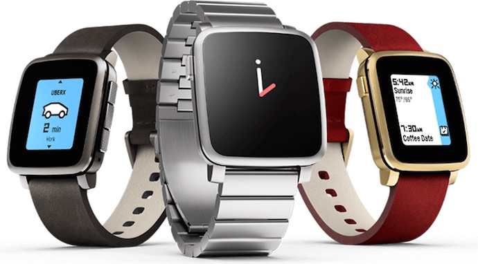
When the smartwatch category began picking up steam several years ago, the original Pebble stood out from the pack. It had incredible battery life and didn’t force you to choose between an Android phone or an iPhone. Since then—and especially in the past 12 months—the wearable technology market has exploded. With smartwatch options like the Moto 360 (reviewed here, and with a new version arriving on shelves soon) and the Apple Watch, Pebble had to up its game to stay competitive. It did so with the Pebble Time, adding a color e-paper display and adopting a new user interface in Timeline. With the Pebble Time Steel, the sharp looks of competing smartwatches are also tackled head on.
Pebble Time Steel Key Specs
|
Pebble Time Steel: Unboxing and Initial Impression
Visually, the Pebble Time Steel looks like the part of a current generation smartwatch. It still has a rectangular case (the Pebble Time Round has just been announced for those who prefer a more traditional watch appearance), but it could pass for a stylish—if slightly thicker than normal—wristwatch.
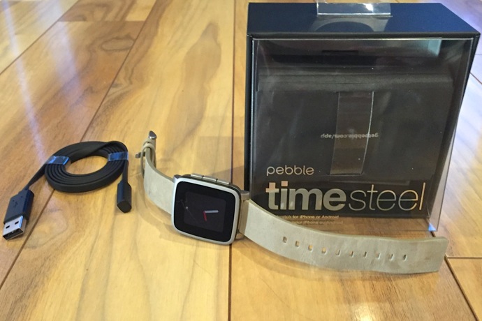
The compact box contains the Pebble Time Steel watch (my review sample was silver with an attractive taupe leather band), a recharging cable and a Quick Start instruction guide. I plugged the watch into a USB port and left it for three hours, the time Pebble recommends for a full charge. It’s worth noting that like many wearables, this smartwatch uses a proprietary charge cable, so you don’t want to misplace it. The cable snaps on to the back of the Pebble Steel to a recessed charging port using a magnetic mount.
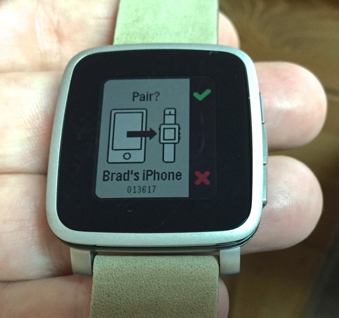
Once at full charge, I paired it with my iPhone. This was actually a little fussier than I expected. It took a few tries before the pairing succeeded, but once there everything was golden.
User Experience
The Pebble Time Steel worked well as a companion device for my iPhone, mirroring notifications and calendar events as my phone generated them. I used the built-in music control function to control playback on my iPhone, which itself was connected by Bluetooth to a wireless speaker. The display is actually considerably smaller than the case (there’s a large black bezel around it), so some of the notifications required scrolling through multiple screens, but it was quite readable.
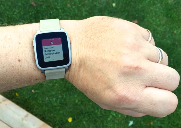
Pebble Time Steel outdoors, showing a notification from my iPhone
Speaking of readable, the e-paper display continues to outperform just about anything else when used outdoors. You know how much better the experience is with an e-reader compared to a tablet in the glare of the sun? Same deal here—you can actually read the Pebble Time Steel display outside, without squinting. It’s less special in a dark room, but a shake of the wrist activates the backlight.
This time around (no pun intended), Pebble has introduced colour, which is a welcome addition. Expectations do need to be tempered, though. There are only 64 colours available, e-paper simply can’t pop the way OLED does and when you use the backlight, they become even more faded in appearance.
Speaking of the backlighting, I’m not sure if it was just my review unit, but you’ll see in any my photos where the backlight is on, that it’s not very even. It works, but the lower left corner has a noticeable hot spot.
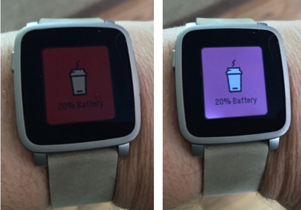
Pebble Time Steel in a daylit room without (L) and with (R) backlight. You won’t see that red battery alert very often …
Android users will appreciate the fact that Pebble has included a microphone, allowing you to dictate responses to SMS texts received on the Pebble Time Steel. That feature has not yet been enabled for iOS users, although Pebble says it’s coming soon.
The new Timeline user interface takes a little getting used to, but once I got the hang of it, I found it quite useful. Essentially, your interaction with the smartwatch is presented as a timeline, with current events (such as appointments or the weather forecast) available at the touch of a button, and the ability to scroll forward or backward in time. Other functions like Setting and Apps are available separately, but Timeline makes it easy to whiz through and see what’s up without having to launch separate apps like a calendar. The only thing I would change is the Back button. I found its location a bit awkward and because it is on the opposite side of the case from other buttons, I would often accidentally hit those while trying to press Back/Power On. Those with smaller fingers may not have the same issue …
The Pebble Time Steel was quite comfortable to wear. It isn’t particularly heavy and the slightly curved back helps it fit more naturally on the wrist. It’s worth nothing that it uses standard 22 mm watch straps, so you can swap the band out if you choose.
 App Selection
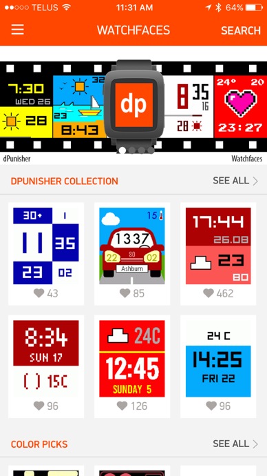
Pebble continues to grow its appstore. There are lot of custom watchfaces (including many that take advantage of the colour display) and there are quite a few useful companion apps.
I installed the Misfit app, which takes advantage of the Pebble Time Steel’s built-in activity and motion sensors to track steps. Unfortunately, the results were off significantly compared to the Fitbit Zip I wore at the same time. I’m not sure if that was the Misfit app (if so, there are alternatives on the Pebble appstore) or the smartwatch sensors, but there are alternative fitness tracker apps available, some of which let you fiddle with sensitivity settings.
The Pebble smartwatch doesn’t have the power, storage or display to handle some of the apps that Android Wear and Apple Watch can offer, but there is still plenty of opportunity to customize and extend the capabilities of the Pebble Time Steel.
Battery Life
Finally, one of the key advantages of the Pebble Time Steel: battery life!
I used an exclamation mark for a reason. The Pebble Time Steel remains a battery champ. I installed apps, used the backlight mercilessly and reviewed non-stop notifications from my iPhone. I used it as a remote to control music playback and spent a day testing its fitness tracking chops.
Pebble says the battery life is rated at “up to 10 days.” After six days of heavy use, I received a warning that the battery was down to 20 percent. After seven days, it was at 10 percent. As I write this, it’s day eight and the watch still shows five percent of a charge.
I may not make it to 10, but the Pebble Time Steel went 7-8 days of heavy use on a single charge and that is incredible, especially compared to the Apple Watch I have to charge every night.
Is the Pebble Time Steel Worth Considering?
There’s a reason why Pebble smartwatches have been popular. The company has made many design choices that endear the devices to tech fans and general consumers who are interested in trying out the whole wearable thing. The Pebble Time Steel is a good looking smartwatch with an always on display that lets it pass as just a regular wristwatch. It may not be able to do all the tricks the competition can pull off, but it still offers a lot—including the things like notifications that I primarily use a smartwatch for, and it can run apps—and it does so while delivering stellar battery life and cross platform compatibility.
So if a smartwatch is on your wish list, you really should check out the Pebble Time Steel. And if you’re the owner of a previous Pebble smartwatch, the Pebble Time Steel with its colour display is a worthwhile upgrade.


