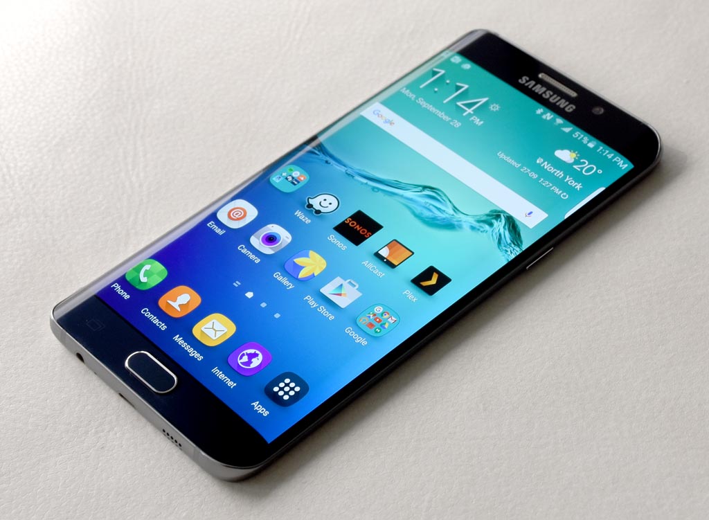
| Display: 5.7-inch 2560 x 1440 Super AMOLED dual-curved display with 518 pixels per inchOS: Android 5.1.1 Lollipop Processor: 2.1GHz + 1.5GHz Exynos 7420 octa-core processor Memory: 4GB RAM, 32GB or 64GB internal storage (no microSD slot) Camera: 16-megapixel rear camera with optical image stabilization, 5-megapixel front-facing Video: Up to 4K Ultra HD video recording Battery: 3000mAh (non-removable) Connections: LTE, Wi-Fi (Wireless-AC), Bluetooth 4.0, NFC, A-GPS, Wireless Charging Dimensions: 6.03 x 3.00 x 0.30 inches Weight: 171 grams Comes in Black and White |
Samsung likes curves enough to put them on almost any screen they can find. Curved TVs are one thing, but this year, the company has really pushed the idea of curved displays on smartphones. The Galaxy S6 Edge, when it launched in the spring, was the first smartphone to have a dual-curved edge display. Now, the Galaxy S6 Edge+ offers a bigger screen with a lot of the same functionality.
The Galaxy S6 Edge+ is very much about size, given that it doesn’t deviate a great deal from its curved predecessor. The unique look such a display provides has to be viewed within the context of what the curves offer in practical terms. Looking good is one thing, doing something useful is another. This is a pendulum that swung a fair bit for me, personally.
Design
The fact the S6 Edge+ is almost exactly the same as the Galaxy Note 5, both in specs and (to some degree) form factor, is another aspect to consider. Where the Note line once had a distinct identity compared with Samsung’s varying array of handsets, the line has blurred significantly now.
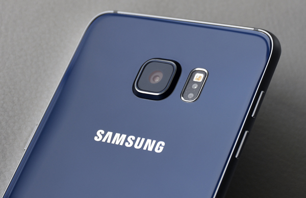
The 5.7-inch Super AMOLED display, while curved on both sides, is the same size and resolution as that of the Note 5. The processor, RAM, cameras, battery and software are all identical between the two. Even the back of the S6 Edge+, with the slightly protruding lens and glass panel, is also the same. The speaker and various ports are also in the same locations. Even the fingerprint reader is duplicated. The only difference is that the Note 5 has a holster for the S Pen, while the S6 Edge+ doesn’t because it obviously doesn’t come with it.
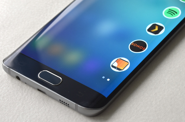
So that leaves the curved display as the main differentiator. The positioning and angle bears no difference to how Samsung did it on the smaller S6 Edge, except the larger screen is arguably more pronounced here.
To add more incentive, Samsung tried to make the edge display more useful and inclusive.
Performance and software
 People edge returns, which is the feature that lets you save five favourite contacts, all of whom are colour-coded, to the first edge screen layout. Missed calls and messages from any of these contacts will appear when swiping from the edge, so you can act on them directly instead of having to launch an app. Put the phone face down, and the edge will light up in their colour for any notification related to them.
Following that is App edge, where you can assign spots to five apps you use most often. The edge features are accessible from the lockscreen, so there is some convenience in bypassing everything else to get there. For me, five apps is too low, since I listen to music from at least three of four on a regular basis.
Then there are edge notifications. Swiping along the edge when the screen is off lights up text with a black background for little battery consumption. The compatible apps are limited, however, and there is a bit of a walled garden to how it works. Outside of Flipboard, Twitter, Yahoo and a few others, edge notifications will only work with the main Samsung apps when it comes to messaging, email and phone calls. If you get, say, a message from WhatsApp or Hangouts, it won’t appear in the edge notifications. Same if you use the Gmail app for your email.
This is something to consider because, beyond all that, the edge display doesn’t do much. The only reason both sides are curved is to accommodate right and left-handed users. For me, the same usability concerns I had with the S6 Edge apply here as well. The larger screen is fine, but the Note 5 has the same size and resolution, so it then becomes a choice between flat and curved, more than S Pen or no S Pen.
This is an easy comparison to make for the simple fact that the software experience—Android and TouchWiz—performs the same way for both devices. What I noted in my review of the Note 5’s software—save for the pen input, of course—is not any different with this phone.

Camera
This is also the case for the camera. Using the same image sensor, lens and interface, photo quality is exactly what I expected it would be after having already tested the Note 5, Galaxy S6 and S6 Edge. There is no inherent advantage between them as far as their respective cameras go.
In fact, the irony here is that the S6 Edge+’s camera is virtually the same as that of the regular S6 Edge. To add something extra, Samsung included a live streaming feature broadcasting directly to YouTube. There is a 30-second delay in the feed, so it’s not as “live” as it could be, but nevertheless, it is there to use. I would advise against using it on LTE/3G because it can take up a fair amount of data if you’re not careful. Short clips should be okay though. On Wi-Fi, it’s good, and you can be more flexible and free in how or what you broadcast. Being at an event offering Wi-Fi only makes that easier.
Still, with Periscope, Meerkat and other live broadcasting apps readily available for Android, it’s not a killer feature for Samsung.
Battery life
 Samsung has moved away from replaceable batteries this year, including memory card slots for expanded storage, and that may be a divisive issue for some users. The increased efficiency of the Exynos processor is meant to take away some of the anxiety over battery life, and for the most part, the S6 Edge+ holds up well. The fact the included charger can fill it up in a short time is also easy to appreciate.
That said, I wouldn’t go as far as saying that battery life is excellent. It’s good, and better than you might expect of a phone this size, but it is prone to drain when certain tasks push it. Regular daily usage of messaging, social media, browsing and online video clips aren’t likely to kill it quickly. It will get you through the day, but it’s likely you will need to charge it before going to bed or when waking up to get ready for work.
Wireless charging is in here, too. Both Qi and PMA standards are supported, so if you have one of those charging pads handy, keeping the phone on there can help keep the battery topped up without needing to plug it in.
Final Thoughts
Choosing this phone above all others is a matter of aesthetics. The curved display, regardless of what it does, is something you either like or are indifferent to. If you fall in the latter camp, then the Note 5 or something else is probably more suitable for you. But if you do like having curves, then the S6 Edge+ is the biggest you can find.
Whether intentional or not, Samsung offers a choice between going flat with the Note 5, or curved with this phone. The uniformity in design and spec leads me to that conclusion, because it effectively emulates the same choice Samsung offered between the regular Galaxy S6 and S6 Edge in the spring. Those devices have 5.1-inch displays. The Note 5 and S6 Edge+ are 5.7-inches each. In keeping with the aesthetic theme, your choice is easy if screen size does matter.
The Samsung Galaxy S6 Edge+ is available now.


