| Asus Zenfone 3 Display: 5.5-inch 1080p IPS display with 401 pixels per inch OS: Android 6.0.1 Marshmallow (upgradable to 7.0 Nougat) Processor: 2.0GHz + 1.6GHz Snapdragon 625 64-bit octa-core processor Memory: 4GB RAM, 64GB (microSD card slot expandable up to 256GB) Camera: 16-megapixel rear camera with optical image stabilization, 8-megapixel front-facing Video: Up to 4K Ultra HD video recording Battery: 3000mAh (non-removable) Connections: LTE, Wi-Fi, Bluetooth 4.2, A-GPS, Fast Charging, USB-C, Fingerprint sensor Extras: Dual-SIM card slot Dimensions: 6.01 x 3.05 x 0.30 inches Weight: 155 grams Comes in dark blue, laser silver, and white |
If Asus hasn’t entered your radar for your next smartphone choice, the company is looking to grab your attention with the Zenfone 3. Having only entered the Canadian market last year, albeit quietly, this handset offers a new look and improved performance from its predecessor. Without any carrier partnership, it also comes fully unlocked, making it attractive for those who want to avoid paying too much and signing a contract.
Having tested the Zenfone 2 last year, I liked what it offered as a mid-range device. The hardware was decent, while the software was a mixed bag. It had a removable back with a dual-SIM card slot, but not a removable battery. The back itself looked nice, yet was made of plastic. Over time, the software started to do wonky things, in part from the bloated interface and apps Asus squeezed into it. The Zenfone 3 (available in dark blue, beautiful laser silver (32GB), and pristine white) aims to take things up a notch in all areas, putting it in serious contention with other mid-range handsets.
Design
On the face of it, this is a noticeable improvement in design philosophy. When I first unboxed the Zenfone 3, I was genuinely surprised. Glass on both sides, fused together with metal edges, it has a refined and elegant look that I didn’t expect. Placed next to its predecessor, the two bear little resemblance, and that’s ultimately a good thing.
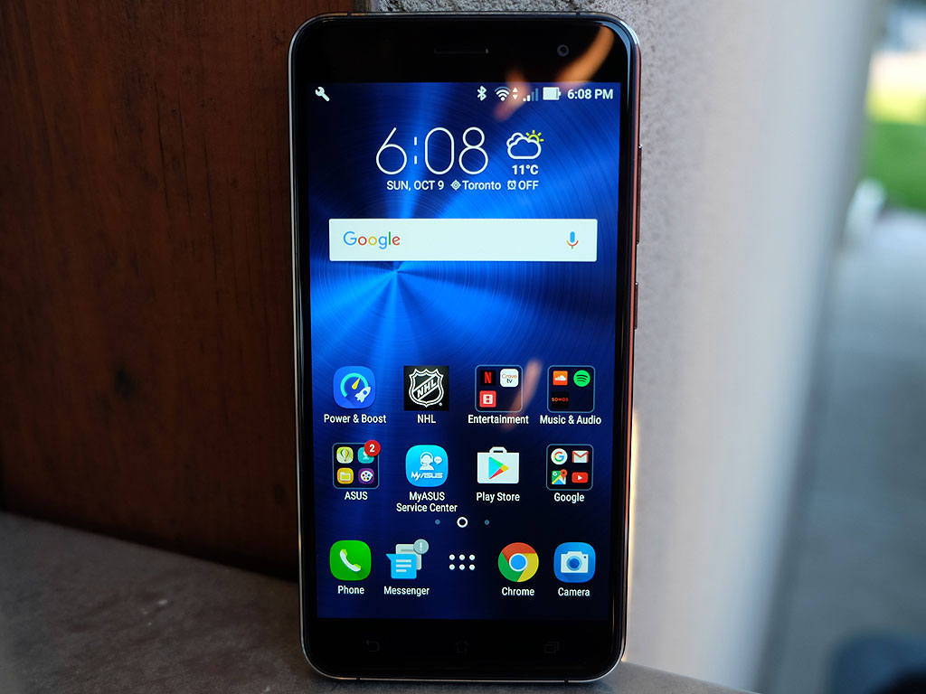
The 5.5-inch IPS display is 1080p resolution, so it won’t hit the same levels of premium smartphones, but that may not be a big deal for some who wouldn’t notice the difference anyway. The same touch-sensitive soft keys at the bottom are the same as the previous model, but beyond that, just about everything has changed or moved.
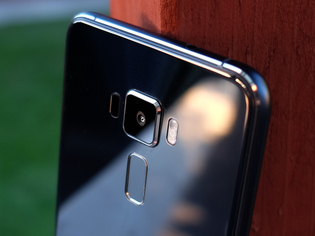
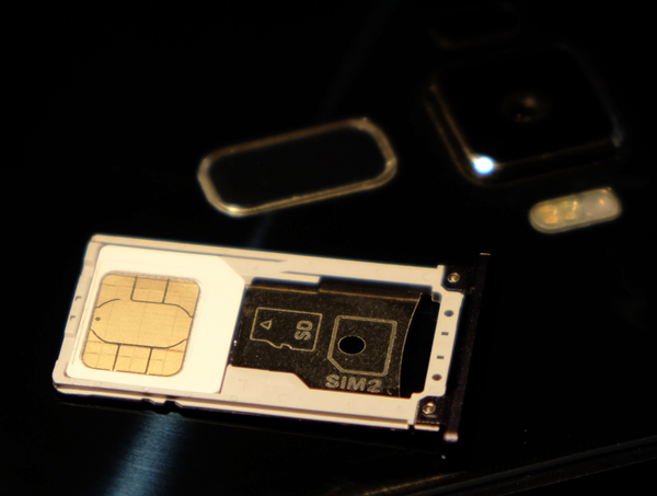
The charging port is now USB-C, moving this device towards the impending industry standard. The power button has been moved to the right side, along with the volume buttons that have also been moved there (they were previously on the back) to make room for a fingerprint sensor under the lens. top and there is a dual-SIM card slot with room for a microSD card too. If it matters to you, there is a 3.5mm headphone jack at the top.
Under the hood, Asus veered away from the Intel chip used in last year’s device and going with a decent Qualcomm chipset. The 4GB of RAM is good to have (and necessary for this phone), and the 64GB of internal storage is a great start, with expansion going up to another 256GB using a memory card (you may technically be able to go up to 2TB). The 16-megapixel rear camera protrudes a little off the surface, and is meant to be an upgrade because of the four-axis optical image stabilization (OIS) system that should help with low-light images, despite a not-so-wide f/2.0 aperture.
If there’s one thing about this glass-heavy design, it’s that the back is every bit a fingerprint magnet. It took less than an hour before I had layered it with fingerprints and smudges—no different, really, than any other phone that has a glass back.

Performance and software
The litmus test for the Zenfone 3 has more to do with software than hardware, mainly because of how memory leaks affected its predecessor. Briefly, a memory leak happens when an app or process consistently takes up a phone’s memory (namely RAM) and doesn’t return any back, thereby resulting in performance lag and other issues.
Seemingly knowing this could happen, one of Asus’ seemingly limitless array of preloaded apps on the Zenfone 2 (called Clean Master) was likely thrown in to offset that. I don’t know for sure, but that was the conclusion I drew after a few months playing with the device.
This was the shadow looming over the Zenfone 3, and with Clean Master gone (replaced with Power and Boost), the same spectre applies here, though I came away pleased that this phone got off to a better start.
Still, I wish Asus would show more restraint and let users explore Android on their own by populating the phone with the layout and apps they want. There are at least 20 preloaded apps coming from Asus alone, all part of the Zen UI interface the company floods across the device’s software. It’s hard not to notice. Notifications are a constant reminder until they’re turned off, and the introductory bubbles that appear after first setting up the phone are early indicators of how overbearing it can all be.
At least something is worthwhile, particularly Splendid, an app that controls the colour temperature of the screen. Turning the bluelight filter on is great for nighttime or low-light settings where the increased yellow tint is easier on the eyes. Do It Later won’t be a replacement for to-do list and tasks apps, but it’s not bad. Laser Ruler is a neat way to measure distance quickly. Mobile Manager is a sort of health check for the phone’s overall state, and includes sections for cleaning up useless clutter to aid system performance, along with a privacy and security one. Both of those require increased access, as in the latter’s case needing approval to make and manage phone calls. Why it needed that wasn’t made clear, which bothered me, but once in, I could at least appreciate what it was trying to show. A separate permissions section is equally useful, though I should note these are also features embedded in Android Marshmallow through the Settings.
Luckily, much of what Asus has thrown in to start can be ignored or disabled, though not removed outright. You can download a different app launcher, disable whatever apps you don’t want, and slowly give the device more of a customized look and feel, if you so choose.
Either way, the Zenfone 3 is a better overall performer, and stood up well with everything I did on it. Streaming video, no problem. Playing casual games, no worries. Call quality was good, and I had no issues running Android Auto on the phone. Being a mid-range handset, it wasn’t as zippy as flagship models, but that’s hardly a surprise.
The fingerprint sensor in the back was quick and responsive, and didn’t feel all that different from others I’ve tried where the sensor is situated there.
Camera
Last year, Asus managed to put in an underrated camera in the Zenfone 2, except for the various gimmicky modes it threw in there. A lot of them used software trickery to make photos look a certain way. Some worked, others were a waste of time. Here, with the Zenfone 3, there are 20 different modes, with some being very specific, like the QR code, selfie, panorama and GIF animation ones.
The two standouts for me were the manual and HDR Pro modes because they exist within the context of making photo composition look better from before the shot is taken. Manual controls offer shooters the chance to adjust settings that can truly make a photo look different, especially when conditions are more challenging. HDR Pro is more of a quick method in doing the same thing because of how it shoots three photos at once — overexposed, underexposed and regular exposure — to merge into one ideal image.
The difference this time around is the camera app is more responsive and the OIS does help keep images sharp. Focusing could be a bit faster, but that’s an easy fix with a software update. There is a neat trick where tapping on the fingerprint sensor snaps a photo — especially useful for selfies. A double-tap launches the camera automatically from sleep. Both of these are off by default but can be turned on by going to Settings > Fingerprint.
Battery life
 I had no problem going through a full day with the Zenfone 3. Battery optimization seems to benefit from the software and app optimization features Asus doesn’t let you forget about. For a device that has a relatively big battery, it lasted longer per charge than other mid-range phones I’ve tested this year. It does depend on usage habits, naturally, though I can say that it handles a rigourous workload better than before.
Final thoughts
There is a lot to like about the combination the Asus Zenfone 3 offers. An elegant design, dual-SIM slot, good camera and solid battery life. True, the overzealous software package isn’t the prettiest, but at least there are ways to remedy that. Getting all that in an unlocked handset that doesn’t require any commitment to a carrier is a bright spot worth more than you may realize. If you want a mid-range smartphone with good overall performance, this one is worth a chance.
The Asus Zenfone 3 is available now in dark blue, silver or white.


