| Display: 1.56-inch (46mm) or 1.37-inch (42mm) IPS LCD displayOS: Android Wear 1.3
Processor: 1.2GHz Snapdragon 400 quad-core processor Memory: 512MB RAM, 4GB internal storage Bands: Leather or steel, lugs offer replacement with any band Battery: 400mAh (46mm); 300mAh (42mm) with Wireless Charging Connections: Wi-Fi, Bluetooth 4.0, NFC, Heart Rate Monitor, GPS (Sport only) Extras: IP67 water resistant Comes in various colours and bands |
Smartwatches running on Android Wear have had a tough go of it since first launching to some fanfare last year. Part of it has to do with the slow appeal of the category as a whole, but the rest can be chalked off to a platform that needs to grow up. With the second-generation Moto 360, Motorola has made a case for putting out a serious contender to win over some hearts and wrists.
Motorola seems well-suited to disrupt the pack. It is, after all, the company that really pushed the concept of a rounded smartwatch with the first Moto 360 last year. As nice as it was, the watch functioned in a technical straightjacket that limited its battery life amid the growing pains of the Wear operating system. The company took on all of that with this iteration, coming to a pretty solid conclusion.
Design
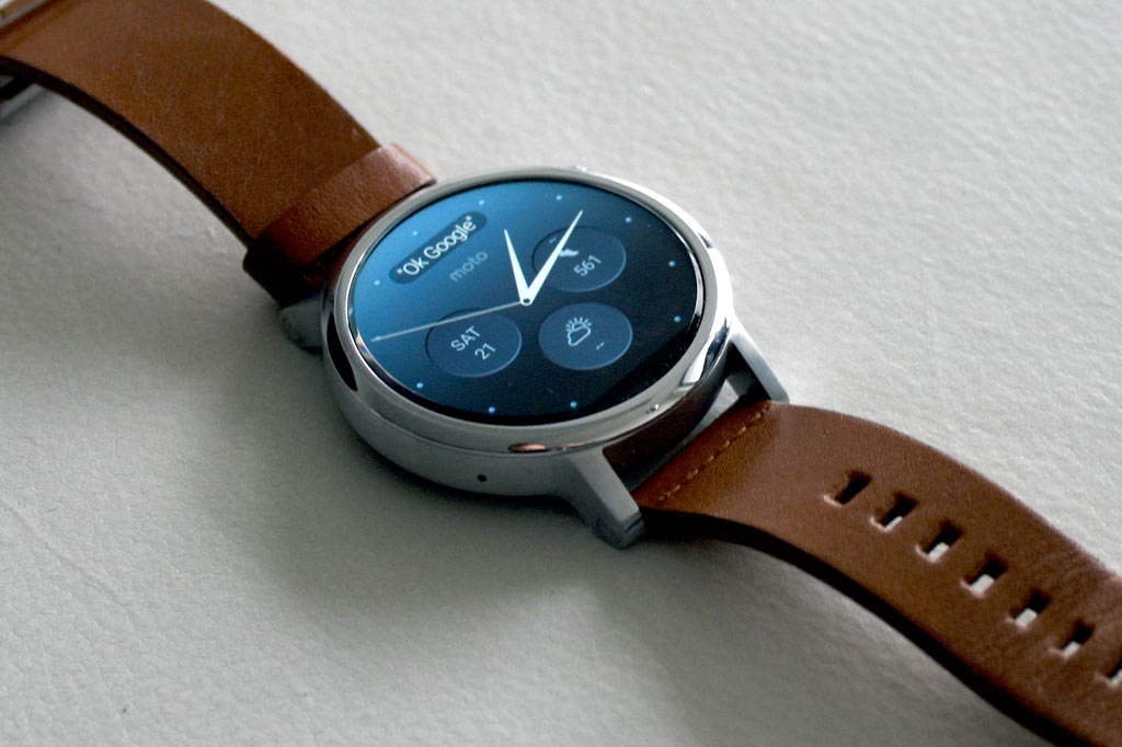
The fact this Moto 360 is rounded like its predecessor is hardly shocking. The same stainless steel casing, chiseled bezel and ambient sensor black strip at the bottom combine for the same distinct look. One key difference is that it’s no longer one-size-fits-all, what with 46mm and 42mm diameter models available. The former is the same as the original, while the latter is aimed at women and men who prefer a smaller timepiece. A differentiator beyond that is the band.
Thinner ones are made for women, with the usual thicker ones made for men. The same Horween leather used last year is back, along with steel in a few different varieties. The exposed lugs (the handles where the bands connect to the body, in case you weren’t sure) on either end are a major concession to consumers who wanted an easier way to change bands, but the resulting cosmetic shift makes this Moto 360 look even more refined than before. A definite win-win.
The internal components are right in line with what other Android Wear watches already have, so Motorola hasn’t crammed in a secret sauce. In fact, the display isn’t as vibrant as some of the other watches currently available. The good news is that some efficiencies have been thrown in to improve on last year’s performance shortcomings.
 Battery life is a major improvement, where I could go up to 36 hours on one charge. That might seem terribly low, but compared to how its predecessor was upon launch last year, this is a big step up. The 36 hours is the number with the ambient light sensor turned on, which lights up the display based on certain wrist gestures and adjusts brightness as well. Turning that off to make it all manual could stretch the battery out well past two days.
The same heart rate monitor is found on the bottom of the watch. The main button on the side was moved to the 2 o’clock location instead of the 3 o’clock, making it easier to get to for adjustments when necessary.
Needless to say, this is a very pretty watch, and perhaps the most aesthetically-pleasing in the Android camp. Refined and stylish, my thoughts were confirmed with the number of questions and compliments I received about it from strangers.
Performance and software
Where Motorola could make adjustments to the Moto 360’s look and feel, performance is largely about Android Wear. Google’s wearables software is still very much a work in progress, with an interface that requires a great deal of swiping in one direction or another. A year later, the same fundamentals hold true, and while improved, it’s best to keep expectations measured going in.
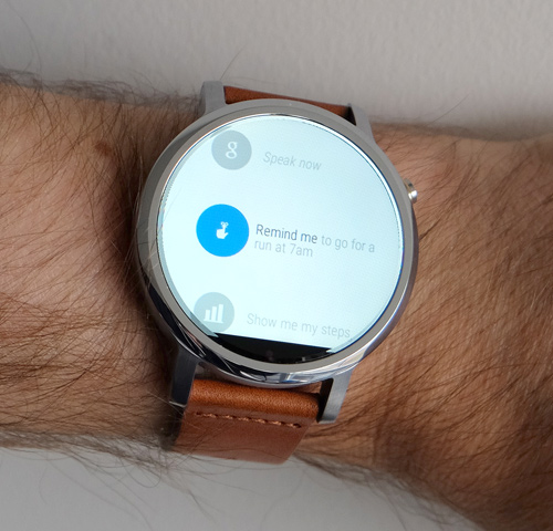
I say that because a watch running on Android Wear is simply an extension of your smartphone. It doesn’t do a whole lot on its own, and so, its primary daily functions include showing notifications, tracking certain health data and telling the time and weather. I could still talk to it by saying, “Ok, Google” and issuing a command, even responding to incoming messages that way, too.
Despite the recurring feeling that something is always missing, this iteration of Android Wear feels more complete and stable. There’s still plenty of room for refinement, and Google will need to come up with something better for integrating third-party apps in a better way, but I at least felt better using it now than I did at this time last year. The company’s developers made some useful changes that positively affect usability and performance.
Some of the tweaks have real benefits. Certain watch faces, like Dials and Dials II, now have small widgets on them with shortcuts to weather, calendar and pedometer. Holding down on any of the widgets opens up customization options for that watch face, like changing the background or accent colour or shifting the order of the widgets.
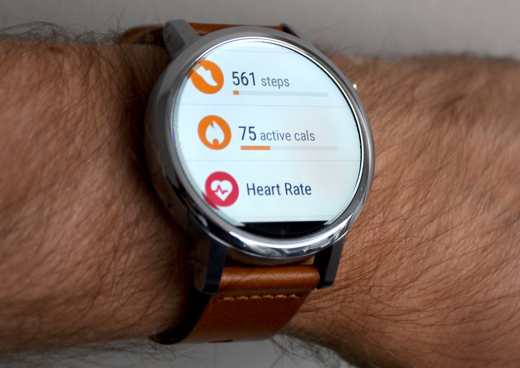
The addition of Moto Body is nice for the convenience it provides, but shouldn’t be mistaken for a comprehensive tracking app. It aggregates your heart rate info, steps taken, calories burned and can offer an analysis of those things. It’s a decent day-to-day fitness companion, since you’re wearing it anyway, but doesn’t have enough depth or context to present a bigger picture like a good fitness band does.
Works with the iPhone
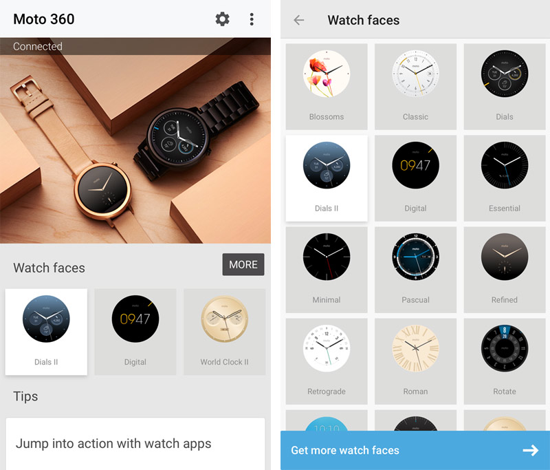 I personally got a kick out of using the Moto 360 with my iPhone, but also recognized the limitations of this cross-platform relationship. I couldn’t respond to incoming messages using my voice like I could with an Android pairing, had no access to third-party apps (though I could see notifications from them) and found the Android Wear app on iOS to be significantly scaled back.
The result is even more what I described earlier—the Moto 360 was little more than a receptionist for my phone. I could answer incoming calls using the watch, which was mainly useful in cases where I couldn’t grab the phone right away or had a Bluetooth headset. But even in the latter case, I was able to answer calls by simply telling the headset to do so. I wasn’t able to control music playback, no matter if the tunes were coming from internal storage or a streaming service.
While it offered some convenience, I wouldn’t recommend buying the Moto 360 to work exclusively with your iPhone.
Battery life
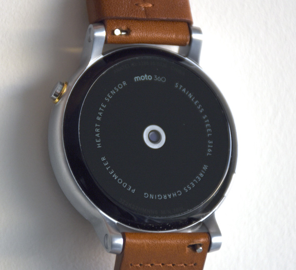 Battery life is one of the biggest improvements from a year ago. I never had to charge this Moto 360 as much as I did the previous model. I tended to keep the ambient light settings and wrist gestures on, so battery life usually tapped out at 36 hours tops. That may not come off as amazing, but in smartwatch terms, particularly for Android Wear, it’s a solid improvement.
With ambient mode and wrist gestures off, battery life could definitely stretch beyond two days. The wireless charging cradle is great, and if you have it positioned on a night table, you could use it as a bedroom clock overnight while you sleep and it charges.
Final Thoughts
In my books, the Moto 360 is one of the nicest smartwatches you can buy. It’s also one I imagine anyone could appreciate with an acknowledgement that it doesn’t have the performance to change your life. That, however, is a category-wide issue, not one specific to this watch. So, in that respect, you’re essentially buying a nice watch that happens to have smart mobile features built-in.
Is the trade-off worth it? Sure, if you feel like it looks good on you and helps keep your phone in your pocket more often. Those two factors are truly where smartwatches are currently focused on. I did like that I could take it to the gym and get some decent workout data, though I could get much more if I had my phone with me. Again, it’s a sliding scale, and one that requires plenty of compromise. One silver lining is that the Moto 360 can really fit in anywhere. Doesn’t matter if it’s a casual setting or a fancy night out.
You can check out the Moto 360 available at Best Buy now.


