Samsung may have pushed as many features as it could into the Galaxy S20 Ultra, but it’s the Galaxy S20 and S20+ that may be the real value options. Like last year with the Galaxy S10 trio, Samsung has launched another smartphone triad with the Galaxy S20. Only this time, the similarities between the devices are closer, which is why these two particular phones are appealing, in my view.
Last year’s models were iterative improvements over what came before. Here, there’s plenty of iteration, along with lasting design and feature changes that stand out. The gap between these two S20 phones isn’t as vast as it may seem, and the choice between them may simply come down to comfort.
Samsung Galaxy S20+ SpecsDisplay: 6.7-inch 3200 x 1440 Dynamic AMOLED display 21:9 aspect ratio with 525 pixels per inch (6.2-inch for Galaxy S20) |
Changing things up
The first thing I have to point out is something I’ve wanted to see for a while. Samsung finally got rid of the curved display it introduced back in 2014 with the Galaxy Note Edge. At the time, the company lauded it as an innovative way to improve access and productivity to apps and information.
It had its moments, but in my experience all these years, it was easy to ignore. Samsung acquiesced and abandoned it in favour of a flat display. Already we’re off to a good start, especially since it makes it easier to both find a protective case and pick the phone up off a table.
The Galaxy S20+ has a large 6.7-inch Dynamic AMOLED display, only 0.2-inches smaller than the S20 Ultra. The Galaxy S20 is the smallest of the three with a 6.2-inch Dynamic AMOLED. Objectively speaking, neither of those screen sizes can be described as “small.” Considering the Galaxy S10+ has a 6.4-inch screen, the S20 and S20+ are right in the ballpark. But the physical differences are obvious compared to both last year’s models and the S20 Ultra.
For one, these two phones are lighter than the S20 Ultra. The camera array in the rear doesn’t protrude quite as far, and for the most part, battery life is better. In lacking curved edges, the two phones are easier to handle than the Galaxy S10 models, though I can see anyone who used the edge display interface lamenting that loss.
Inside and out
Last year, Samsung kept the S10 and S10+ relatively close in specs, deviating with the S10e. That’s very much the case here too, except for variances in the camera. All of the S20 models run on the same Snapdragon 865 processor and offer either 128GB or 512GB of storage. The S20 is the outlier in that it only comes with 128GB, but there is a microSD card slot to expand that.
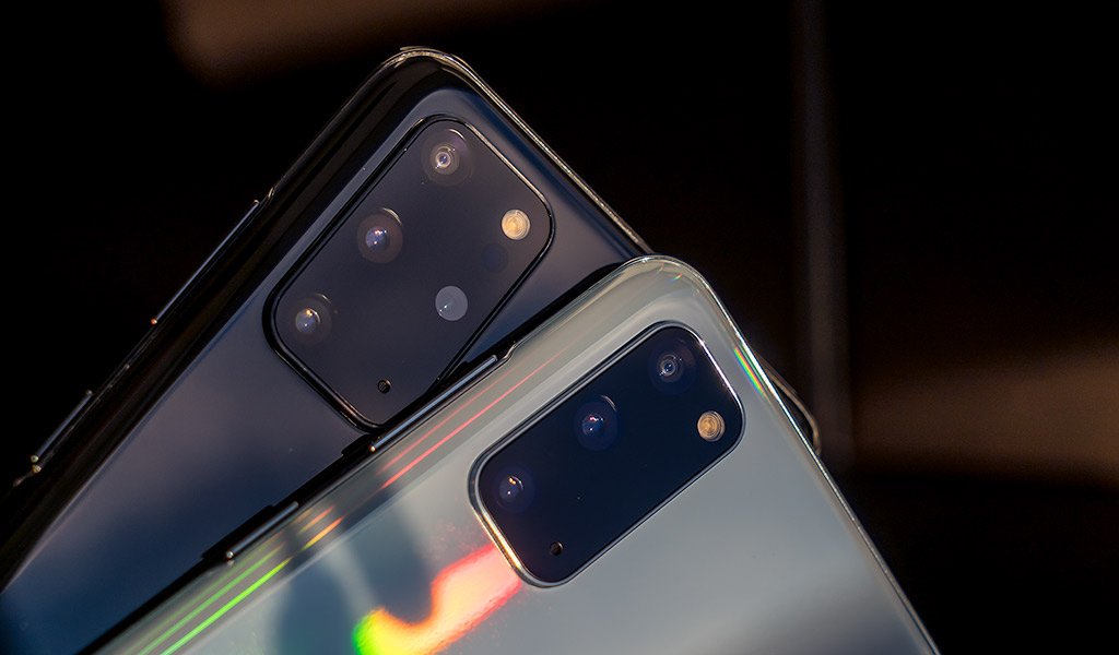
The camera setup between the S20 and S20+ is virtually identical, save for one of the image sensors. Samsung put a 12-megapixel sensor in the standard wide camera for both devices, but used a higher 64-megapixel sensor for the S20’s telephoto lens. The S20+ isn’t bad off, though, as it has its own 48-megapixel sensor for its telephoto lens.
Those numbers may pale in comparison to the S20 Ultra’s 108-megapixel standard wide camera, but as I’ll explain later, the gap between them isn’t as huge as you might think.
Samsung also removed the dedicated Bixby button and moved the power button to the right side. It effectively combined the two buttons together into one, where lining it up on the right with the volume buttons feels more in line with most Android phones these days.
And if you’re looking for a headphone jack, forget it. It’s gone. Samsung finally cut out one of the enduring design principles around its phones. I can see it being problematic for some, but by now, wireless headphones and earbuds (not to mention Bluetooth) are good enough to pick up the slack. I used both phones with the Galaxy Buds+ true wireless earbuds and enjoyed the tight integration between them.
Performance and software
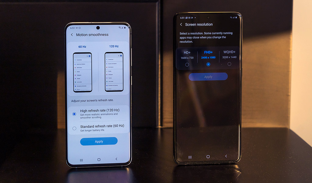
Despite hyping it, Samsung doesn’t turn on 120Hz refresh for the screen out of the box. Go to Settings>Display>Motion smoothness and select it from there. Even if you know nothing about what 120Hz means, you will surely notice how much smoother it is. Everything about the Samsung’s One UI Android interface is buttery, and so are apps supporting that refresh rate.
It’s available on both phones and is worth using. The one catch is that it does affect battery life, so you would have to use it and gauge performance from there. To me, though, it’s worth using as much as possible.
The other missing spec is the screen’s resolution. Again, to keep battery life optimal, Samsung chose to have the 2400 x 1080 resolution as the default. You can increase that to 3200 x 1440—basically 2K—but this is one that I think is more subjective. I rarely used it other than for testing because, once selected, it disables the 120Hz refresh. That applies to both of these phones (and the S20 Ultra).
Still, these two phones are unmitigated beasts for performance. The fast chipset and ample RAM make them adept at handing just about anything thrown at them. Whether I was streaming media or editing a photo in Adobe Lightroom, I never once felt like I was wearing them out.
Camera
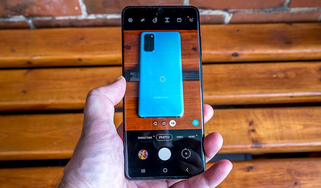
Camera performance and results are huge determining factors nowadays, and with good reason. The cameras in high-end phones are powerful, and Samsung has tried to make them resourceful, too. Look at the menu of options and settings in either of these two phones and you’ll see what I mean.
Samsung added a few new modes: Single Take, Pro Video and 8K video. Known for its share of gimmicky features, I actually grew to like Single Take for what it is, which is a fairly dependable way to capture a scene multiple ways at the same time. Its usefulness is limited because it’s largely pointless to do it with a static subject, but with some creativity, it can offer something unique and memorable. For example, if you use it just as a child is blowing out candles on a birthday cake, it will capture the child, the wider scene of friends and family, plus short video clips.
You might think you’re losing something with a 12-megapixel sensor compared to the S20 Ultra, but not necessarily. The S20 Ultra uses pixel-binning, meaning it splits a standard pixel into smaller ones to increase the overall number. The S20 and S20+ don’t do that. Moreover, these two phones have noticeably larger pixels compared to the Galaxy S10 and S10+, making them better suited for low-light and night photography.
I would just suggest neutralizing some of Samsung’s “help” in how its camera works. The scene optimization mode can overdo post-processing, giving photos an unnatural sharpness. With people, it does the opposite, overly smoothing skin. It’s certainly not a ‘beauty mode’ but it all but acts like one, whereas the front-facing camera curiously doesn’t do the same thing.
Pro mode is still my preferred option for the control it offers. I just wish Samsung would let users shoot in it with all three rear lenses. Night mode is better than it was last year, so long as you adjust exposure.
In fact, this was one annoying facet I had to deal with. Yet again, Samsung’s software overcompensates for lighting by jacking up the shutter speed every time I focused on a subject, forcing me to dial down the exposure to balance things out.
I’ve been hard on the camera array but it does shoot excellent photos in varying circumstances. It’s just that you have to make use of all the available tools to get the most out of it.
About the telephoto lenses
If you’re wondering why Samsung would go so big with a 64-megapixel telephoto lens in the S20, and 48-megapixel telephoto in the S20+, it’s to make up for what’s physically not there. Let me explain.
In short, neither of these telephoto lenses come with a significant optical zoom. The 3x zoom is actually a hybrid, most of which is made up by just cropping the frame instead of getting closer to the subject. To put this in perspective, these lenses have a 76-degree field of view, whereas the standard lens is at 79-degrees. Clearly, not a big difference, and certainly not one consistent with what a true telephoto lens is.
Samsung noted this as “Hybrid Optic Zoom” in its specs, but the actual “optic” part only represents 1.06x of the 3x. The rest is simply cropping and software. That’s a key reason why the 10x hybrid zoom—which is quite good on the S20 Ultra—isn’t as effective on these two phones.
Video recording
Another reason Samsung equipped them with these sensors is to facilitate 8K video recording. To shoot in 8K, you need at least a 33-megapixel sensor or higher, and so, the camera app automatically switches to the larger sensor in the S20 and S20+ to capture the scene.
Samsung made a big deal out of 8K recording, and maybe it will have some viability down the line. But as of now, I found little reason to use it. I don’t have an 8K TV, nor do most people. Without one, it’s hard to even view the content at that resolution anyway. There’s not a whole lot of 8K content available, so by the time 8K adoption grows, Samsung will have already moved on to newer devices.
The more impactful option, at least to me, is shooting in 4K at 60fps. If you’re capturing a sporting event or just kids playing, for example, the quality and resolution will be easier to appreciate.
In addition, the Pro Video mode is also worth trying. Like the Pro photo mode, there are granular controls for composition. Not only can you adjust the shutter speed, ISO, white balance and focus, but also temperature, saturation, highlights, shadows and contrast. It’s a decent toolset, except it’s missing one thing: 24fps. I love shooting at that framerate because it gives footage more of a cinematic flair. For reasons that are a mystery to me (and anyone else concerned), Samsung doesn’t offer it.
Battery life
Samsung made positive strides on battery life going back to previous models, and that continues with these two devices. I never really worried about losing power on any given day because they both held up so well. On regular and steady usage, I got hours of video playback, surfing, email, messaging, music streaming and photo-editing, and still had time to spare at bedtime.
These results improved if I turned off 120Hz refresh, but I wasn’t willing to make that sacrifice all the time. If I truly got low, I would just use Battery Saver to cut down notifications and conserve until I could charge again.
Both phones come with a 25W charger in the box, capable of fast charging. You could go from zero to full in roughly one hour, but don’t bother getting a 45W charger because neither of these phones support the speed associated with that level of charge, unlike the S20 Ultra.
Wireless PowerShare is available in case you want to charge another device wirelessly through the back of the phone. It’s not going to fully charge another phone, but it is good for smaller devices, like the Galaxy Buds or Buds+, for instance. Anything that supports Qi wireless charging is compatible.
5G connectivity
I didn’t have access to a 5G network while testing either of these phones, so can’t relay any experience based on that. Canada’s major carriers have indicated they will launch this year, so even if 5G isn’t technically “on” now, it will be starting with the largest cities first.
Final thoughts
Not surprisingly, these are two of the best Android phones I’ve used in their respective classes. However, I do question Samsung’s wisdom in releasing two devices that are this similar. Had the S20 and S20+ been merged into one device, I think it would’ve appealed to the same users anyway. So much of their respective performances are the same, and that’s why it really comes down to size.
If you prefer a smaller size for easier one-handed operation, the S20 delivers on that. The S20+ is still wieldy in its own right, though. I highly recommend getting a case, no matter which way you go. These are delicate phones, and while they have water-resistance, a drop could easily lead to damage.
The Samsung Galaxy S20 5G and Galaxy S20+ 5G are available now in cosmic grey, cloud blue and cosmic black.

