 Getting to know the Vivosmart Line
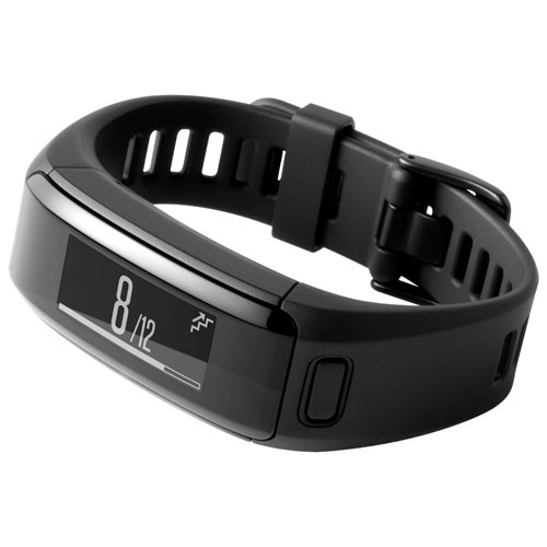
The past two iterations of the Vivo line from Garmin were the Vivosmart and the Vivofit 2. This new device, the Vivosmart HR, draws design cues from both. It has a soft sport band that feels like it will stand up to the elements when you’re working out. That band is connected to a hard plastic frame for the tracker; there’s the usual green LED setup in the bottom that measures heart rate.
 A look at the hardware
It’s easy to get this thing fastened on. Not as easy as Apple’s sport band on the Apple Watch, but I think I’ve been spoiled there. Getting the right fit took a bit of time; the Vivosmart HR isn’t very flexible, making it tough to find exactly the right fit. Once you do, however, it starts to disappear in your mind, until you get a notification.
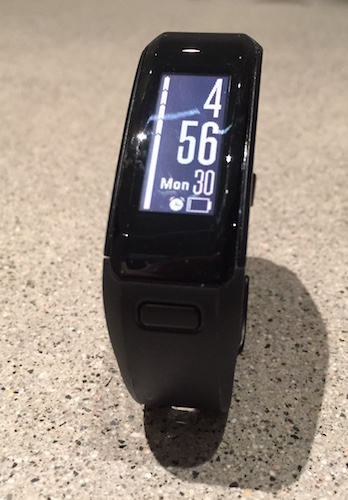
The display is an integrated 160×68 pixel touchscreen that’s about an inch long and about half an inch wide. The backlight is bright enough to be seen in broad daylight. There’s no colour here, something that seems absent as Microsoft, Apple, and every Android Wear maker on the market goes to bat with colour, but it works; the display is readable, it’s responsive, and it gives you the information that you need.
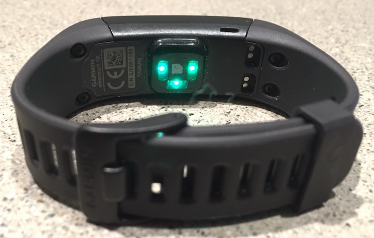 Getting it charged up for the first time was a pain in the butt, as was every time I wanted to charge it after. Again, maybe I’m spoiled by the Apple Watch (a device that is, let’s be clear, like three or four times the price of the Vivosmart HR, depending on your model) but going from inductive charging to “snap this weird bit of plastic together with your fitness band…don’t worry, it’ll work about 40% of the time” is a real let down. Still, when the Vivosmart HR is charged, it’s CHARGED. I charge my Apple Watch every night. The Vivosmart HR was charged Monday. It’s Friday, and it still has battery.
Getting it setup was simple; download the App from Google Play or the App Store and pair it inside the app. I did need a firmware update, which I performed through my computer, before it would sync.
 Using the Garmin Vivosmart HR
With the Vivosmart HR on my wrist, I went about my daily business. I went to the gym twice with it on, only having to remove it for deadlifts (I had to start using grips for deads after I hit a 300 lb lift). Let’s start with the display: it’s remarkably easy to read when you orient it vertically, which is probably my favourite feature. The time is large and very visible. When you want to interact with the Vivosmart HR you can simply swipe on the display and it’ll take you through the available pieces of information:
- heart rate
- smart notifications (wherein your phone’s notifications are send to the screen of the Vivosmart HR)
- music control
- distance travelled (in miles or km, depending n your preference)
- calories burned
- exercise minutes per week (you can increment these manually or have them bump up by heart rate)
- flights of stairs climbed (something I miss from my Fitbit Force)
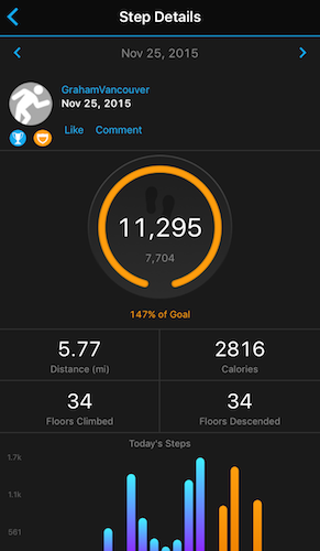
- steps taken
The challenge here, after using a smartwatch like the Apple Watch, is that only some of these pieces of information are vertical when you’ve selected the vertical orientation. I’ve become used to reading my watch like a watch, so going back to read the band like a band its just… awkward. It’s understandable that you can’t fit a notification on a narrow, tall screen, but perhaps that means that this isn’t great place for those notifications.
I did find that things were more readable if I wore the tracker facing inwards, on the inside of my wrist. I’ve worn my watches this was for years; as a soccer referee it’s easier to have the watch face on the inside, as you can check your watch quickly by flipping your wrist up. It also has the added benefit of keeping the face of the device tucked into your body, making it less likely that you’ll scrape it on things. The downside there? If you’re typing on a computer you probably have your wrists turned downwards (I worry for you if you don’t) and it can be quite uncomfortable with the display of a Vivosmart HR facing down. Why? Because the Vivosmart is pretty darned tall.
I don’t have massive wrists, but I don’t have small ones either, and I find that the actual “lump” of the Vivosmart HR is just a shade too big for me. It doesn’t fit into the cuffs of my button down shirts, meaning I have to roll the shirt back a touch (or all the way up to the elbows if it’s warm enough). It’s difficult to get into coats in the winter, and feels like it catches on stuff all the time. Perhaps I was spoiled by the thinness of the Fitbit Flex and the Apple Watch, but I would have loved to see a device from Garmin that was a touch wider (with a more square screen) that is just a bit thinner.
Summing it up
So to recap: The Vivosmart HR is an accurate, light fitness tracker that ties in perfectly with MyFitnessPal and Apple Health. It has a comfortable band that uses rectangular slots that are relatively easy to fasten. It has insanely long battery life, and is easy to navigate to the information you need on the device. It has a great app and a convenient website.
It’s also a little large (height-wise) for my taste, and can make you feel clumsy by adding about 3/4 of an inch to your wrist.
All in all, the positives outweigh the negatives, especially for a device priced as economically as the Vivosmart HR. If you’re looking for a heart rate tracker that has a ton of other great features, and you feel like you can work around the display orientation and tracker size issues, the Vivosmart HR is your best buy on the market.

